Modern Spanish Revival: How to Get the Look Without Gutting Your House
I redid my living room three times before I figured out why it kept looking like a furniture showroom instead of the warm, sun-baked rooms I kept pinning. The answer was embarrassingly simple: I had the right colors and the wrong textures. Modern Spanish Revival lives and dies on how things feel, not just how they look in a photo. Once I swapped my flat-painted walls for a limewash finish and stopped buying anything with a shiny finish, the room finally clicked.
If you’ve been searching for how to make a space feel like Ojai or Santa Barbara without a full renovation, this is the style, and here’s exactly how to build it.
What Modern Spanish Revival Actually Is
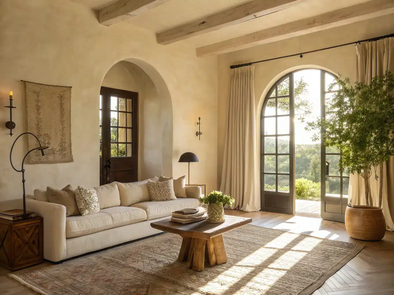
It’s a mashup of Spanish Colonial Revival, Mediterranean, and stripped-down modern minimalism. Think thick plaster walls and arched doorways, but furnished with clean-lined sofas instead of heavy carved furniture. Less hacienda theme park, more “old house that a good editor lives in.”
This style is for you if you want a room that feels warm, architectural, and collected — but you’re allergic to anything that reads as a themed restaurant. It’s not rustic-cabin warm and it’s not stark-white-modern cold. It sits right in the middle, and that middle ground is what makes it hard to get right on the first try.
Where it works best:
– Living rooms with plaster walls, beams, or oversized art
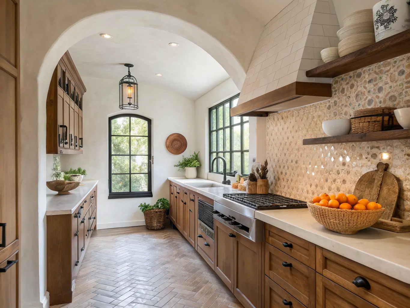
– Kitchens with tile backsplashes and warm wood cabinetry
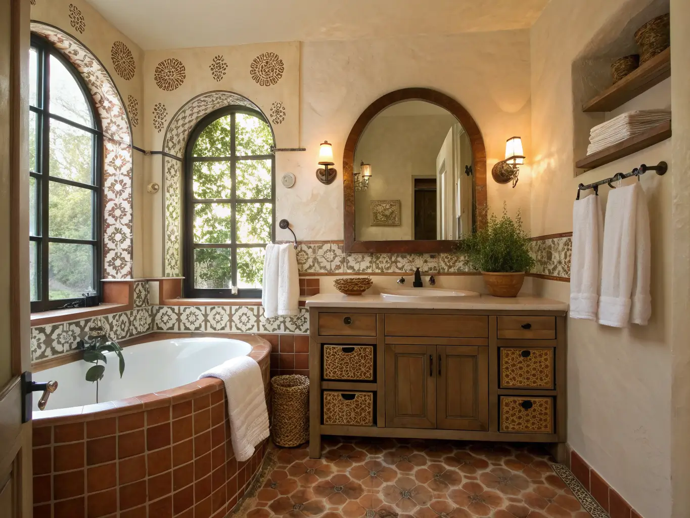
– Bathrooms with arched mirrors and hand-painted or zellige-style tile
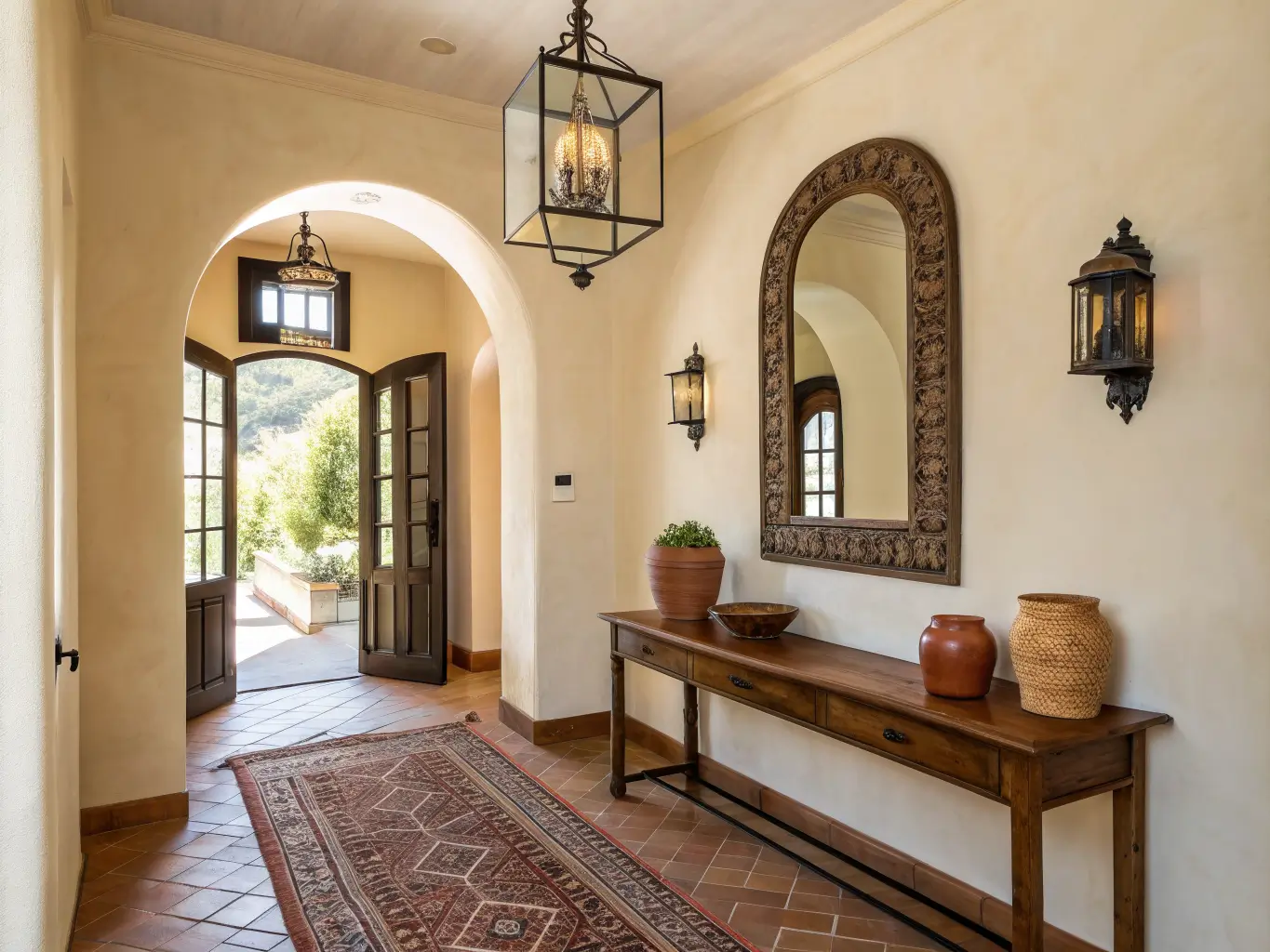
– Entryways where a statement door or lantern can do the heavy lifting
Color palette: warm white, ivory, clay, terracotta, sand, camel, muted olive, deep brown, rust, with small hits of black iron. Skip bright white, cool gray, and saturated Mediterranean blue — those fight the warmth that makes this style work in the first place.
The Pieces That Actually Make It Read as Spanish Revival
You don’t need all of these, but you need a few, and they need to be the right ones.
Hero pieces (pick 2–3 to anchor a room):
– An arched mirror — I got mine secondhand for $60 and it did more for my entryway than anything else in it
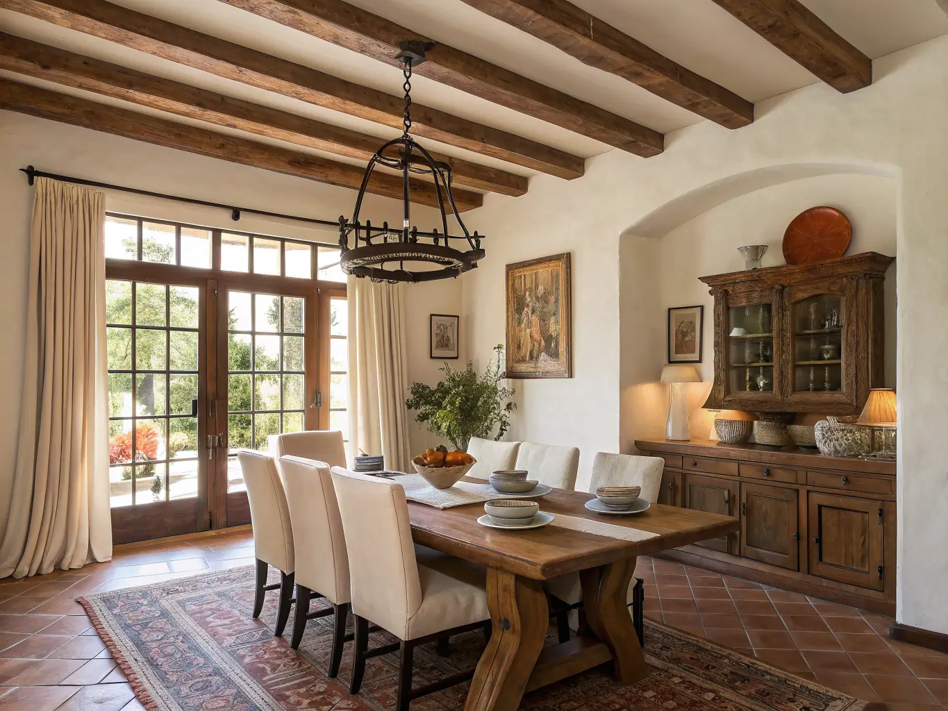
– A wrought iron or aged-metal pendant/lantern light
– A textured area rug in warm neutrals, ideally something with visible weave
– A wood dining table, console, or bench where you can actually see the grain
– A plaster-look or limewash wall finish as the backdrop for everything else
Supporting cast:
– Matte ceramic vases and terracotta vessels — nothing glazed to a shine
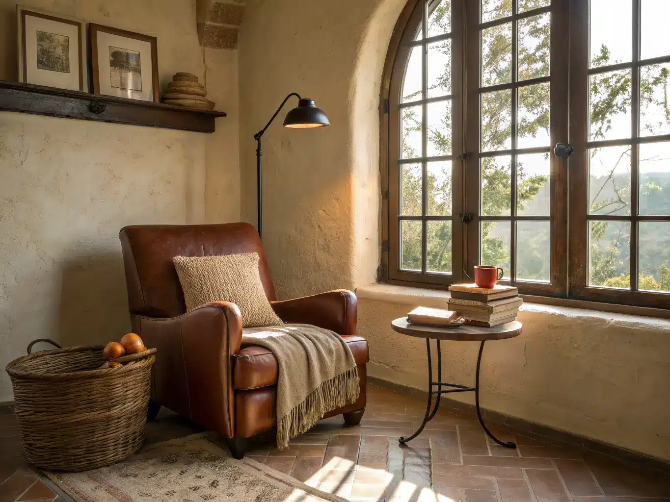
– Woven baskets, leather, and linen pillows
– Hand-painted tile used as trays or small decor objects
– Black iron candleholders, curtain rods, or hardware
Small-dose accents: a little Moorish-inspired pattern on a pillow or tile insert, one piece of large-scale earthy artwork, and Saltillo or terracotta tile if you can swing even a small accent zone like a hearth or entry.
How to Actually Put the Room Together
Work in this order — it matters more than people think.
1. Lay down a warm neutral base. Creamy white, soft beige, or a plaster tone on the walls. This is your canvas, and it needs to feel a little imperfect. A flat white wall reads modern-minimalist, not Spanish Revival. If you can’t do actual plaster, a limewash-effect paint (Portola Paints and Farrow & Ball both make versions) gets you 80% of the way there for the cost of a gallon of paint.
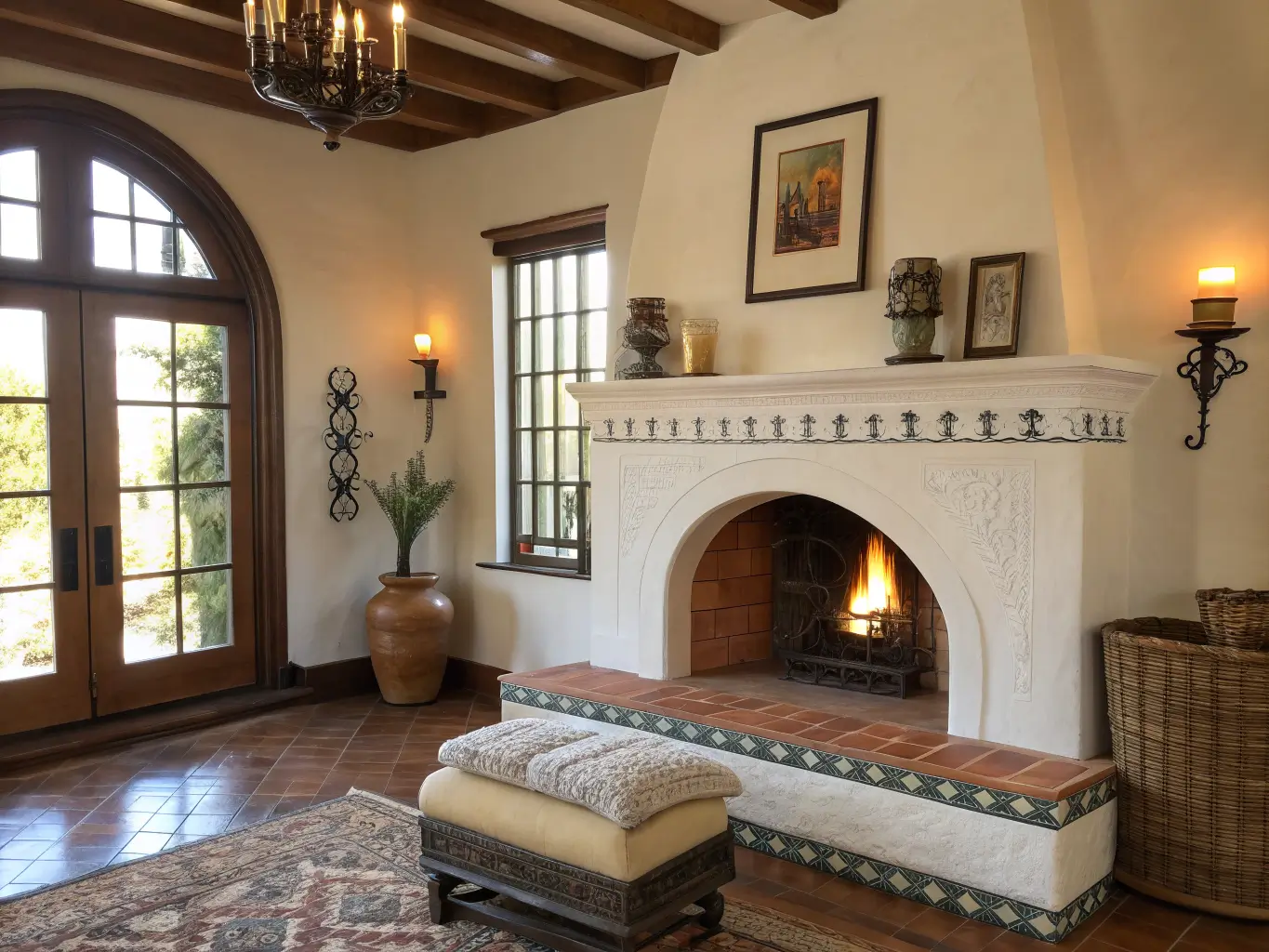
2. Add one architectural moment. This is your focal point — a carved or arched door, a tiled fireplace surround, an arched mirror leaning against the wall, or an oversized pendant hung low over a dining table. You genuinely only need one. I made the mistake early on of trying to make every wall “do something,” and the room ended up exhausting to sit in.
3. Layer natural materials. Wood, terracotta, linen, stone, woven fiber — in that order of visual weight. Repeat at least one material twice in the room. My dining table is a raw-edge wood slab, and I picked up a wood-framed mirror at a flea market specifically because it echoed that tone. That repetition is what makes a room feel decorated on purpose instead of assembled from a catalog.
4. Finish with vintage-feeling accessories. Pottery, sculptural objects, a stack of old books. Group things in odd numbers — three ceramic vessels on a console reads intentional; two reads like you ran out of stuff.
A rule of thumb that saved me: if a piece is shiny, perfectly symmetrical, or made of chrome and glass, it’s probably fighting the room instead of joining it.
Budget: Where to Spend and Where to Save
– Budget refresh ($300–$1,500): New textiles, a couple of ceramic pieces, a pendant light swap, and wall art. This is genuinely a weekend project.
– Mid-range makeover ($2,000–$8,000): Add a statement rug, upholstered seating, real pendant lighting, and a small tile installation like a backsplash or fireplace surround.
– Full reworkation ($10,000+): Custom plaster, arched openings, Saltillo or terracotta flooring, cabinetry, and courtyard or exterior work.
Spend on: lighting fixtures (they’re the thing everyone notices and cheap ones look cheap fast), a real wool or textured rug, and any tile work since it’s semi-permanent.
Save on: vases, trays, and small ceramics — thrift stores and HomeGoods have decent versions constantly. My best terracotta pieces cost me under $15 each from a local pottery sale, not a design store.
Rental hack: peel-and-stick tile on a backsplash or stair riser, and limewash-effect paint (fully removable with primer) instead of actual plaster.
Mistakes That Make It Look Like a Theme Instead of a Home
– Over-theming. Too many “old world” details at once and it starts to look like a set for a movie about Spain. The whole point of the modern version is restraint.
– The wrong whites. Bright, cool white walls undercut everything else you’re doing. Warm it up.
– Skipping texture. A flat wall with a smooth sofa and glossy accessories will never read as this style no matter what colors you use. Texture is not optional here — it’s the whole mechanism.
– Pattern overload. Pick one tile motif or one textile motif to lead. Don’t let three different “Spanish-inspired” patterns compete in the same room.
– Cold overhead lighting. One harsh ceiling fixture kills the mood instantly. Layer in lamps, a pendant, and candles so the light feels warm from multiple sources, not one flat wash from above.
Keeping It Feeling Fresh, Not Static
Repeat your materials, don’t rotate your whole palette. Keep the room anchored in ivory, sand, clay, tobacco, olive, and iron black, and just shift the accents seasonally:
– Spring/summer: lighter linens, fresh greenery, dial back the dark textiles
– Fall/winter: deeper rust, chocolate, boucle throws, more candlelight
Cheapest way to update the whole feel of a room: swap lampshades, pillow covers, and curtain panels before you touch the furniture. I do this twice a year and it costs less than one new chair.
If you want to push the style in a direction, it blends well with a few others:
– + Scandinavian: lighter wood, fewer accessories, cleaner lines
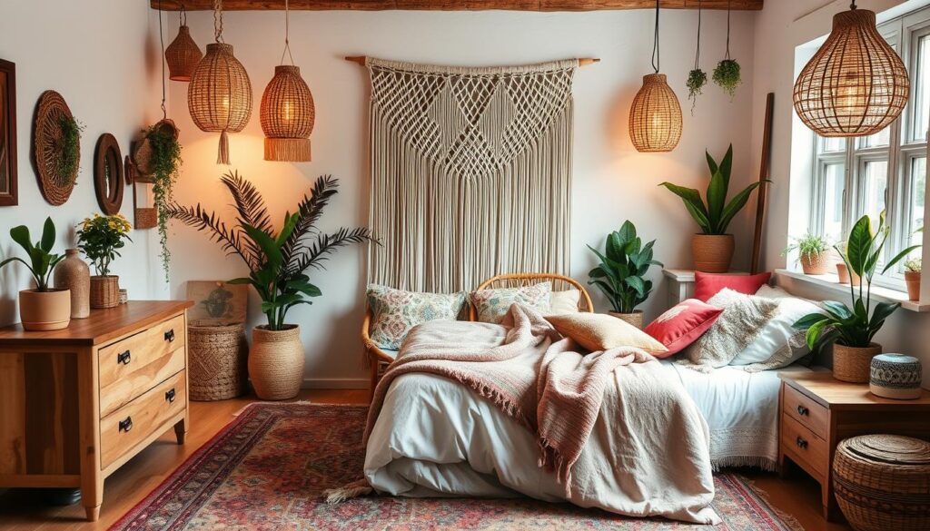
– + Boho: more handmade ceramics and layered textiles
– + Coastal: softer whites and sun-washed clay tones
– + Industrial: black steel lighting and simplified furniture against the warm wood
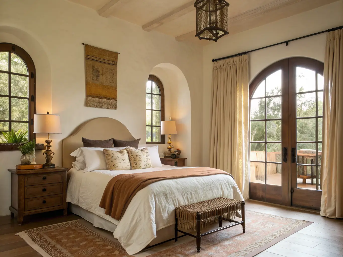
The version of this style that actually lasts in your house is the edited one. Every time I’ve overdone it — too many tiles, too much iron, too many “authentic” touches — the room stopped feeling like mine and started feeling like a rental listing photo. Pick your one architectural moment, layer your textures honestly, and let the rest of the room breathe around it.
More Ideas to Explore
Keep the momentum going: Mediterranean Home Style: A Complete Guide to Getting the Warm, Sun-Washed Look Right covers another angle worth a look.