Modern Minimalist Kitchen Design: A Room-by-Room Guide to Getting It Right (Without Making It Feel Cold)
A modern minimalist kitchen is the kitchen everyone says they want and almost nobody actually pulls off. I know because I spent a full year with a kitchen that looked “minimal” in photos and felt like a hospital supply closet in real life. White cabinets, white counters, empty surfaces — and somehow it was still the room I liked being in least. Turns out minimalism isn’t about having less stuff. It’s about having the right stuff, hidden or displayed with real intention. Once I figured that out, the whole room changed without me spending much money at all.
Here’s everything I learned putting one together — twice, since I got it wrong the first time.
What Modern Minimalist Kitchen Design Actually Means
This style sits close to Scandinavian design and what a lot of people are now calling “modern zen” — clean lines, quiet palettes, almost nothing on the counters. But the defining trait isn’t the color scheme. It’s the discipline. Every object in the room has to earn its spot, and everything that doesn’t need to be seen gets hidden.
It works especially well in:
– Small or galley kitchens — fewer visual breaks make the room read bigger
– Open-concept layouts — a busy kitchen ruins sightlines into the living room; a minimal one disappears
– Kitchens people actually cook in — hidden storage means less mess even mid-recipe
It’s not for someone who wants to display their grandmother’s dish collection or keep six appliances on the counter. That’s a different, and equally valid, style. This one’s for people who want the kitchen to feel quiet.
The Real Cost of a Minimalist Kitchen (Three Tiers)
I get asked this constantly, so let me be blunt about ranges:
– Light refresh — $150 to $800. Swap hardware for integrated pulls, buy matching airtight canisters, add drawer dividers, put in a strip of under-cabinet LED lighting. Weekend project.
– Mid-range update — $1,500 to $8,000. New pendant lighting, a backsplash swap, better internal storage systems (pull-out pantry, appliance garage), maybe one new integrated appliance.
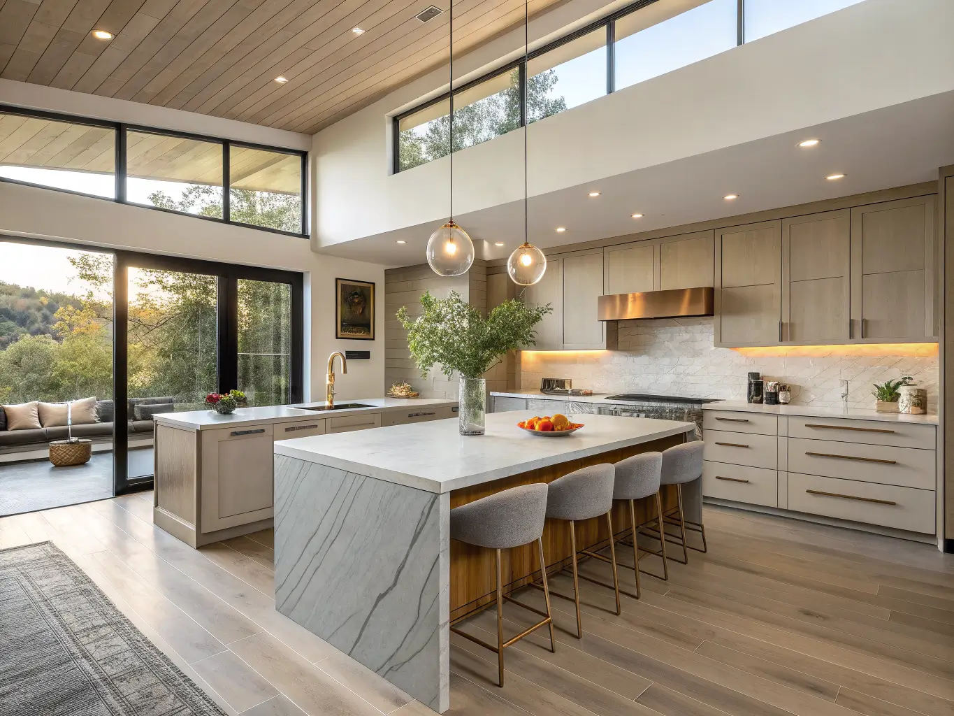
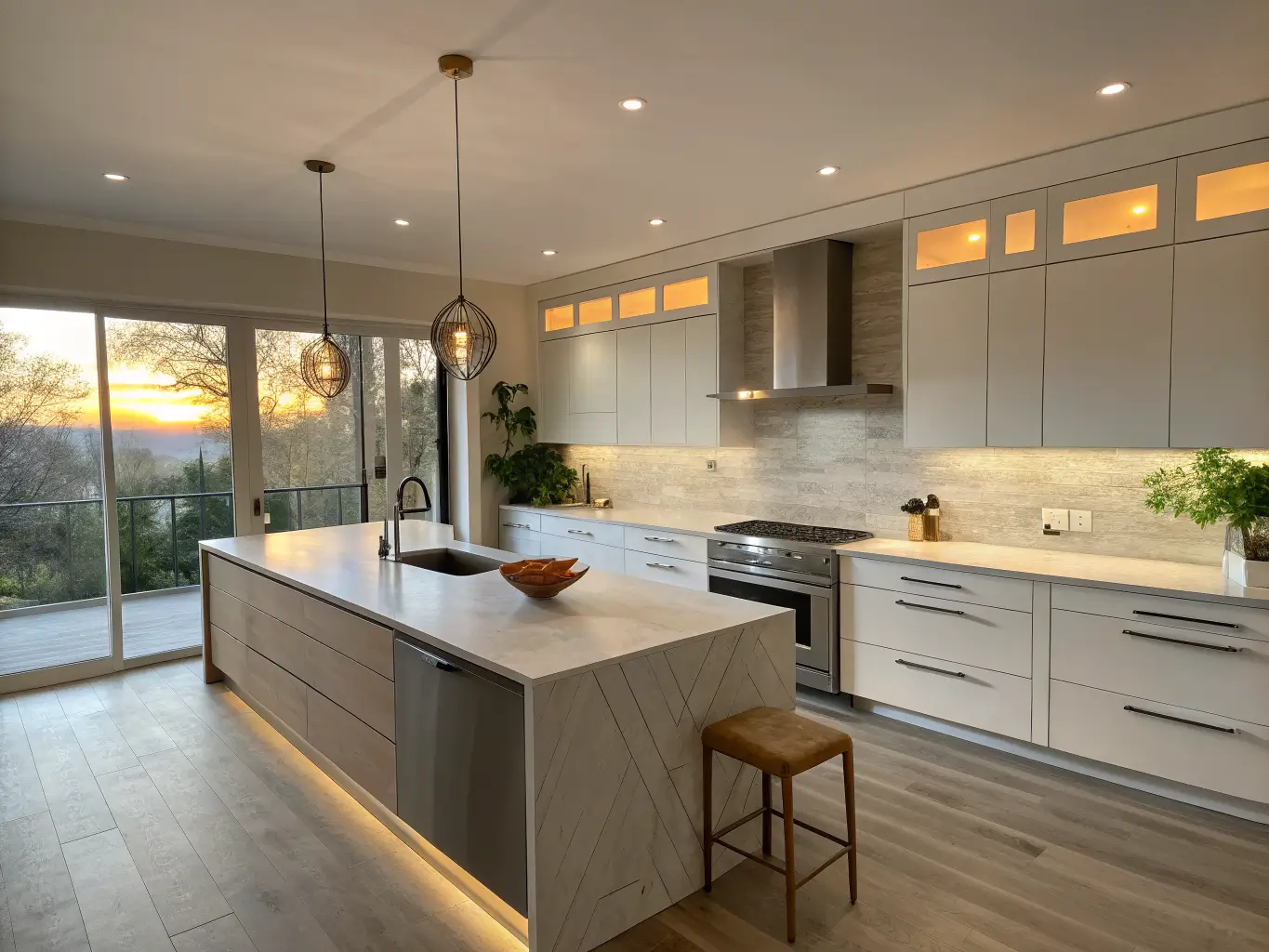
– Full remodel — $20,000 to $60,000+. Handleless cabinetry, panel-ready fridge, continuous stone from counter to backsplash, a waterfall-edge island. This is where the magazine-cover kitchens live.
I did the light refresh first, lived with it for eight months, then did a mid-range update once I knew exactly what bothered me. That order saved me from buying things I didn’t actually need — like an appliance garage I thought I wanted until I realized I only owned two small appliances anyway.
Timeline-wise: a styling refresh takes 1–3 days. A more involved decluttering-plus-hardware-plus-lighting project takes 2–6 weeks, mostly because decision fatigue is real when you’re choosing between four shades of greige. Full remodels with new cabinetry run months, obviously.
The Colors and Materials That Define the Look
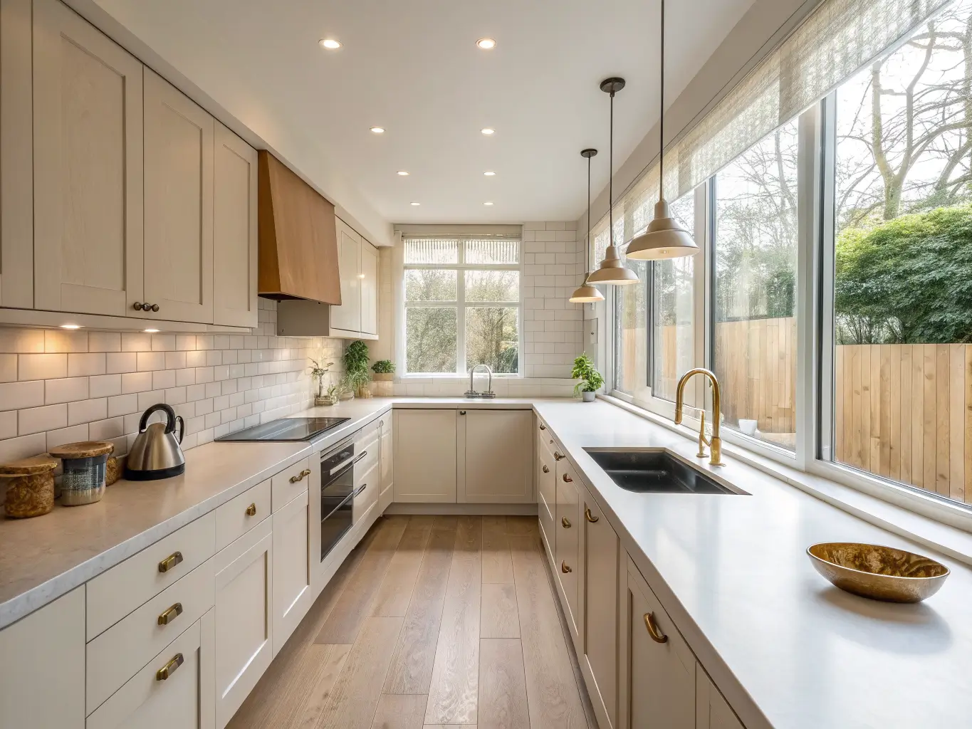
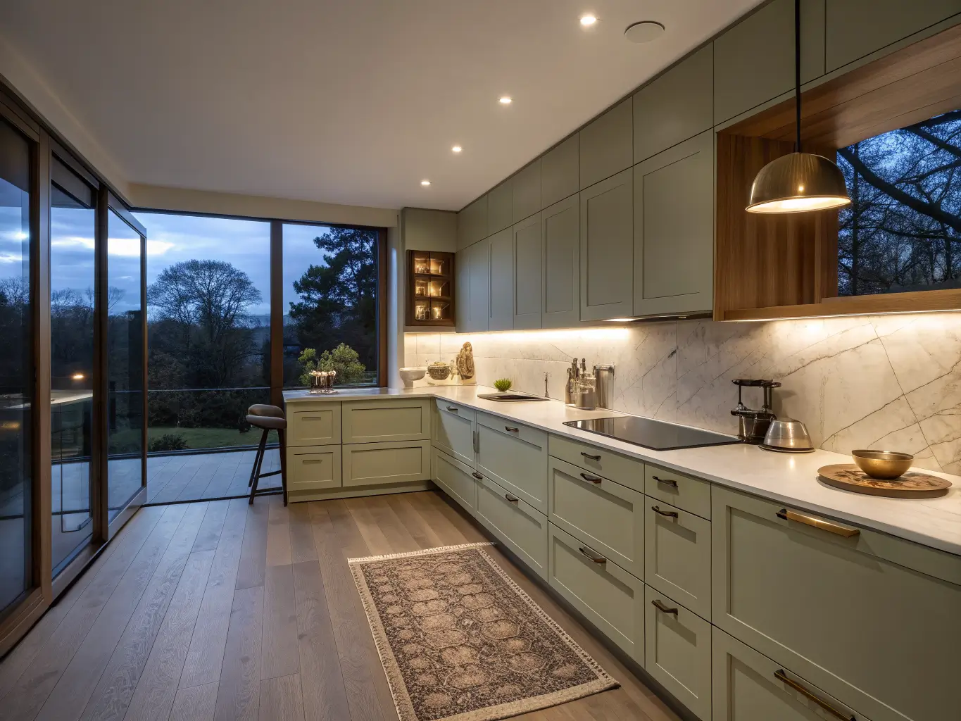
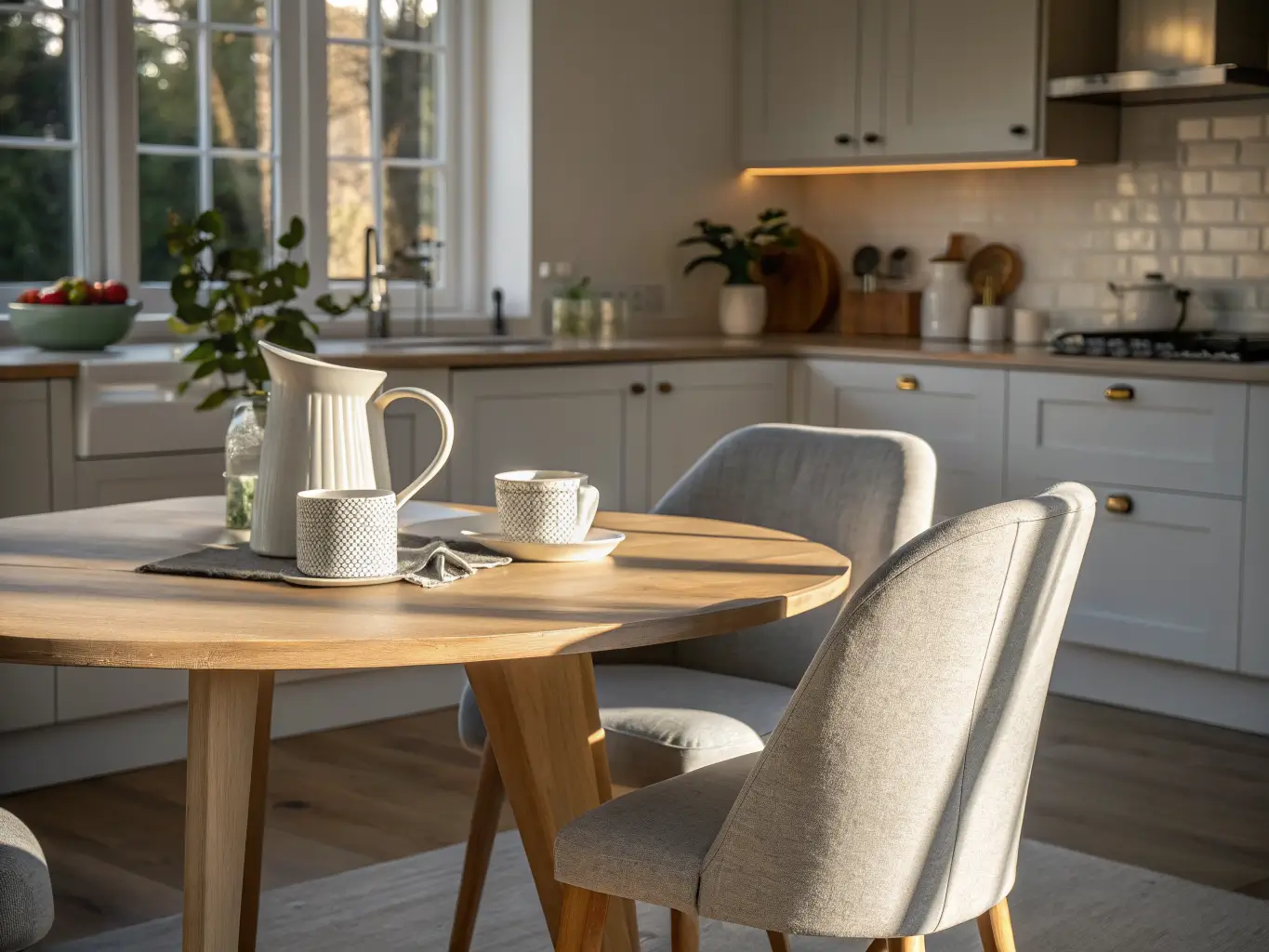
Forget stark white — that was my first mistake. Current minimalist kitchens lean warm white, greige, soft gray, and beige, sometimes with a muted earth tone like sage or terracotta worked in as an accent. Warm neutrals photograph less dramatically than bright white, but they’re the reason a room feels calm instead of clinical.
Materials to know:
– Flat-panel cabinetry — no raised details, no ornate trim
– Quartz or honed stone counters — honed (matte) finish over polished; polished stone reads glossy and busy under kitchen lighting
– Light wood accents — oak or walnut, used once, not scattered across three surfaces
– Matte finishes over glossy ones, almost everywhere
– Brushed metal — brass, black, or champagne, picked once and repeated
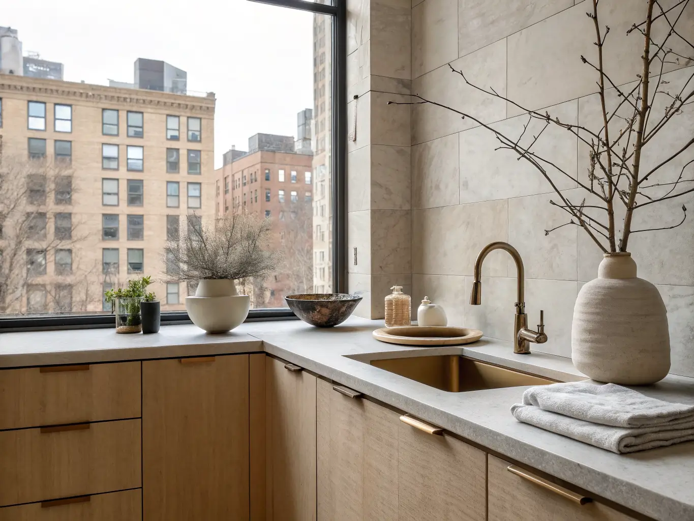
My rule of thumb: four to six neutrals, one accent tone, one accent metal. That’s it. I made the mistake of mixing brushed brass hardware with a matte black faucet and warm oak shelves in my first pass — three competing “accents” made the room feel indecisive, not curated. I redid the hardware in brushed brass to match the faucet and the room instantly calmed down.
The worth having Pieces That Make This Style Work
Flat-panel or handleless cabinetry. Push-to-open mechanisms or integrated grip channels instead of visible pulls. This is the single feature people mean when they say a kitchen “looks minimalist.”
Integrated appliances. A panel-ready fridge (fronted with a cabinet panel so it disappears into the run), a concealed dishwasher, a flush or low-profile cooktop. This isn’t just aesthetic snobbery — visible appliance fronts are the biggest source of visual noise in a kitchen.
One continuous surface material. Counter and backsplash in the same stone or quartz reads as one uninterrupted plane instead of two competing zones. It’s a small decision that has an outsized effect on how “finished” the kitchen looks.
A simple island, ideally with a waterfall edge (the countertop material wraps down the sides like a monolithic block) or at minimum clean, unadorned panels.
Slim pendant lighting. One fixture, simple form, warm bulb temperature (2700K–3000K, not the blue-white of a hardware store bulb).
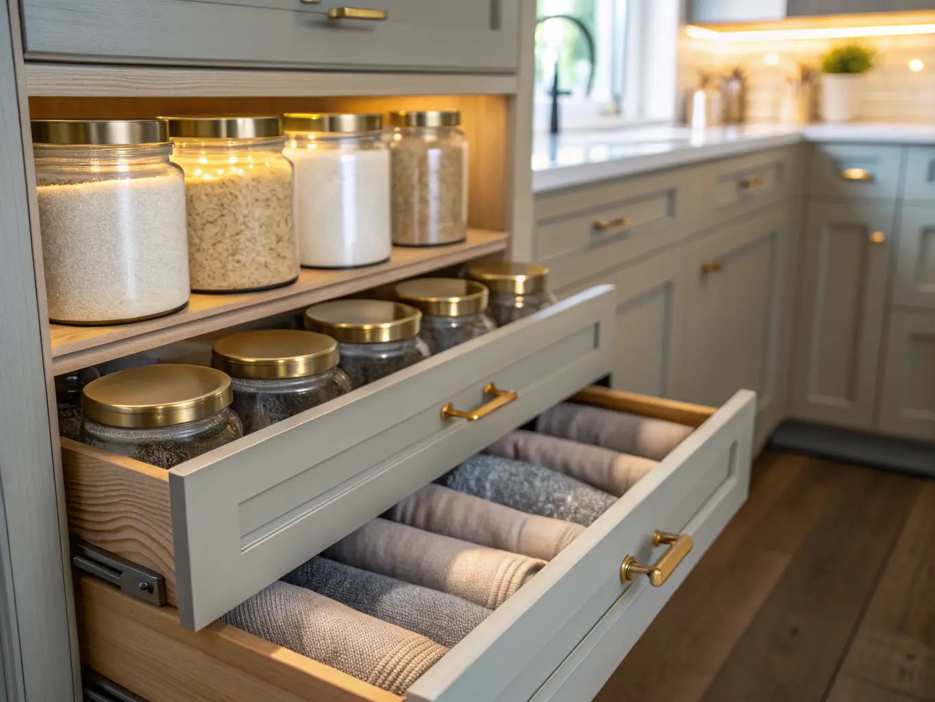
Hidden storage systems. Pull-out pantry shelves, drawer dividers, an appliance garage if you have three or more small appliances. This is the part people skip and then wonder why their “minimalist” kitchen still looks cluttered — the stuff has to go somewhere, and if it’s not hidden, it’s on the counter.
A small handful of intentional decor objects. One ceramic vase, one wood bowl, a linen towel, maybe a stool with some shape to it. Three or four total objects, max, visible at any time.
How to Set It Up: Step by Step
Step 1 — Declutter first, decorate second. Pull everything off the counters. Sort into keep, donate, toss. I found a rice cooker I hadn’t used in two years and a garlic press with a broken hinge doing nothing but taking up drawer space. Be honest about what you actually reach for.
Step 2 — Clear the counters almost completely. Leave a kettle, soap dispenser, maybe a cutting board leaned against the backsplash. That’s the ceiling, not the floor.
Step 3 — Standardize your containers. Mismatched cereal boxes and half-bag ziplocs in the pantry undercut the whole look even if nobody but you opens that cabinet. A set of matching glass canisters (I use a $40 set of six from a home store, nothing fancy) makes the storage look designed instead of accumulated.
Step 4 — Fix the lighting before you fix anything else. Open up window coverings, add a warm LED strip under the cabinets, and if you’re only changing one fixture, make it the pendant over the sink or island. Lighting temperature does more to make a white kitchen feel warm or cold than paint color does.
Step 5 — Choose one main surface material and let it run through counters and backsplash if your budget allows it.
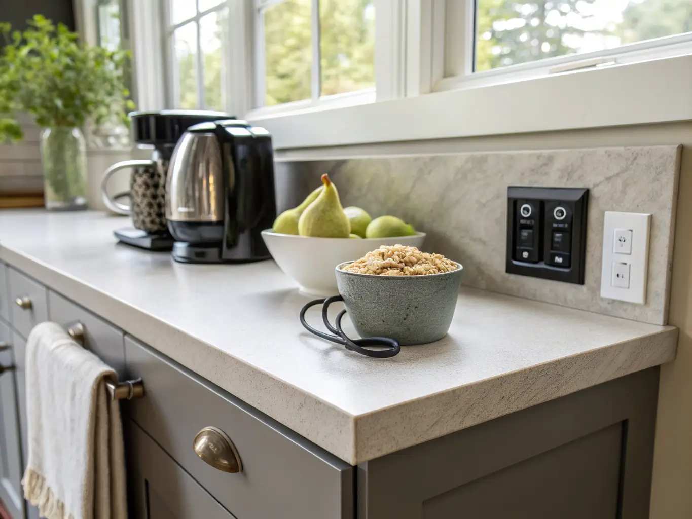
Step 6 — Hide the functional stuff. Panel-ready appliances if you’re remodeling; if not, a cabinet with a pull-out shelf for the coffee maker and toaster works almost as well. Pop-up outlets built into the counter are a small upgrade that solves the eternal cord-clutter problem — I wish I’d known about these before I drilled outlets into my backsplash.
Step 7 — Add your few accessories. One wood board standing upright near the stove, one plant (I keep a single olive branch in a tall ceramic vase — costs nothing to refresh seasonally), one bowl for fruit.
Step 8 — Edit again, a week later. Once you’ve lived in it, something will feel like it’s there “just because.” Take it out. This second edit is the step almost everyone skips, and it’s the one that separates a minimalist kitchen from a kitchen that just looks empty.
Common Mistakes (I’ve Made Most of These)
– Confusing “empty” with “organized.” My first version had bare counters but a chaos drawer that made cooking miserable. Minimalism needs a storage system behind the calm surface, not just less stuff on top of a mess.
– Mixing too many finishes. Pick one wood tone, one metal, one stone pattern. Three wood tones in one kitchen (light oak floor, honey-toned cabinets, dark walnut island) is the fastest way to make a small space look busy.
– Going all-white with zero texture. This was my exact mistake. All white, all matte, no variation — it read sterile, not serene. Adding a honed (not polished) stone counter and a linen runner fixed it without changing a single color.
– Leaving cords and small appliances exposed. A beautiful minimalist counter with a tangle of charger cords behind the coffee maker undoes the whole effect. Hide the outlet strip, loop the cords, or get a pop-up outlet.
– Overstyling open shelves. Open shelving photographs beautifully with four items on it and looks like a garage sale with fourteen. If you’re not disciplined about restocking sparsely, close the cabinet doors instead.
Keeping It Looking Good Long-Term
The look doesn’t survive on its own — it survives because you maintain the system behind it.
– Do a monthly counter audit. Mail, a stray charger, a coffee mug collection — they creep back. Five minutes once a month keeps it in check.
– Limit your decorative categories permanently. One vessel type, one wood tone, one metal, one textile. When you’re tempted to buy a “cute” new object, ask what it’s replacing, not just where it’ll go.
– Refresh seasonally, but small. Swap the bowl filler (citrus in spring, gourds in fall), change the linen towel, rotate one ceramic piece. Don’t redecorate the whole room every season — that defeats the purpose of a style built on restraint.
Budget Moves and Style Variations
If you’re not ready for a remodel, the highest-impact low-cost changes are: swapping to handleless or integrated pulls, adding drawer inserts, replacing one pendant light, and repainting cabinets in a warm neutral instead of stark white. All four together run under $800 and change the entire feel of the room.
If you want to push the style in a direction:
– Minimalist + Scandinavian — light oak, white, soft gray, simple functional forms
– Minimalist + modern zen — muted neutrals, heavier emphasis on natural texture, even sparser styling
– Minimalist + earthy modern — warm beige and sand tones with sage accents, more stone and wood
The direction 2026 kitchens seem to be heading is warmer than the stark white minimalism of a few years back — more texture, more muted earth tones, less “surgical.” That tracks with what I learned the hard way: minimalism without warmth just reads empty. Minimalism with the right textures reads calm.
More Ideas to Explore
Keep the momentum going: Halloween Bedroom Decor Without the Cliché covers another angle worth a look.