What Mediterranean Interior Design Actually Is
You’ve seen the Pinterest boards. Arched doorways, terracotta pots, that specific shade of chalky white wall that looks like it’s been baked in the sun for a century. But every time you try to recreate it, your room ends up looking like a beach-themed restaurant or, worse, a hotel lobby from 2009 with rope mirrors and starfish. That gap — between the real thing and the version most people accidentally build — is what I want to close here.
I redid my own living room in this style two years ago, and the first pass was a disaster. I bought a rope-wrapped mirror and a woven fish wall hanging because I thought “coastal” and “Mediterranean” were the same thing. They’re not. I returned both within a month. What actually worked was slower and less obvious: a limewash paint treatment, one good terracotta lamp, and patience.
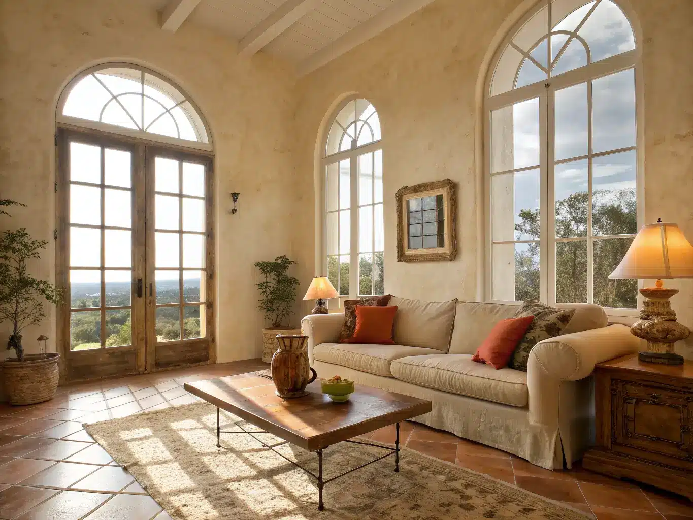
Mediterranean design isn’t one country’s look. It’s an umbrella pulling from Spain, Italy, Greece, southern France, and often Morocco and Turkey — places that share a climate, a light quality, and a building tradition, even if their tile patterns differ. What ties it together is warmth: warm materials, warm light, warm neutrals with a jolt of color from the landscape — olive trees, terracotta rooftops, the sea.
Modern interpretations of the style, the ones showing up in current design coverage, blend in organic modern restraint and a touch of coastal breeziness. Less ornamentation than the heavy, carved-wood Mediterranean interiors of decades past. More plaster, more negative space (the empty, uncluttered areas that let a room breathe), fewer knickknacks.
Who it’s for: people who want a home that feels lived-in and tactile rather than showroom-perfect. If you like touching your furniture — rough plaster, nubby linen, a stone tabletop with actual variation in it — this is your style. It also just works if you get good natural light, since the whole palette is built to catch and reflect sun.
Where it shines: living rooms, kitchens, bathrooms, entryways, and especially anywhere with an indoor-outdoor connection — a sunroom, a covered patio, a kitchen that opens onto a deck.
The Color Palette: Warm Neutrals First, Accent Colors Second
Get this part wrong and nothing else matters. The base is always a warm neutral:
– Warm white, cream, sand, limestone beige for walls and large surfaces
– Terracotta, burnt umber, ochre for warmth and grounding
– Olive green, cobalt blue, seafoam, azure as the accent — pick one, maybe two, per room
Here’s the rule I wish someone had told me earlier: one dominant neutral, two to three accent colors, max. I made the mistake of trying to fit terracotta AND cobalt AND olive into my living room at once. It looked like a spice rack. I stripped it back to cream walls, terracotta in the lamp and one throw pillow, and cobalt in a single ceramic vase. Suddenly it read as intentional instead of thrown together.
Key Materials That Make the Style Read as Authentic
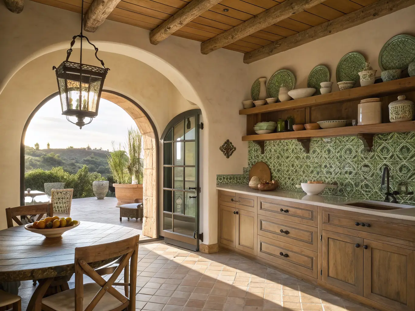
This is a material-driven style, not a paint-color-driven one. The finishes are doing most of the work.
Walls: Limewash or plaster, not flat paint. The difference is real — limewash has a cloudy, variegated texture where light hits it differently depending on the time of day. A gallon of limewash paint runs $60–$120 and a small room takes a weekend to apply if you’re doing it yourself. It’s forgiving of imperfection, which is the point.
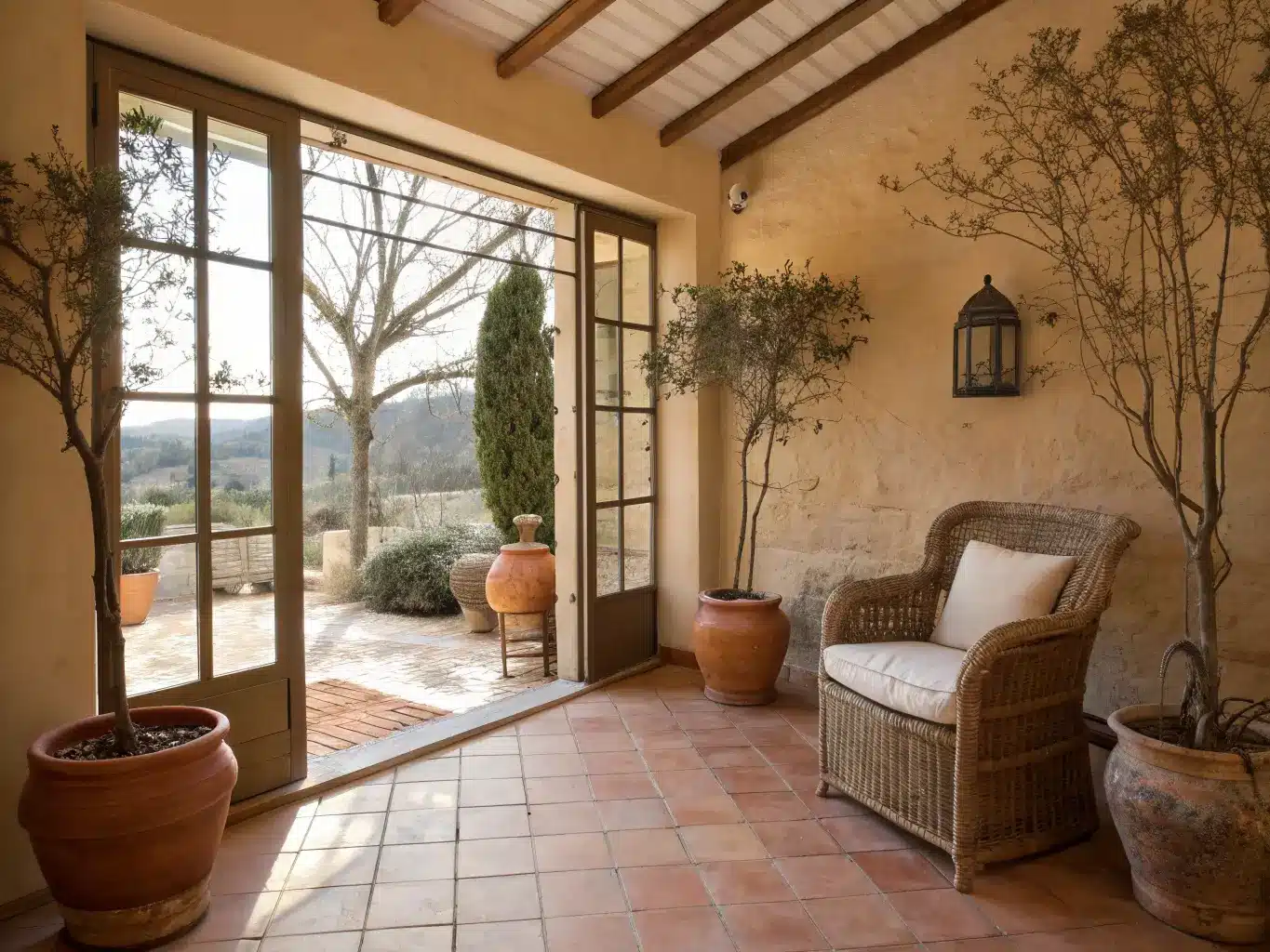
Flooring: Terracotta tile, or a terracotta-toned floor if you’re not ready for a full tile job. Handmade, slightly irregular tiles look more real than a perfectly uniform terracotta-look porcelain. If you’re renting, a terracotta-colored jute or wool rug does 80% of the visual work for a fraction of the cost.
Stone: Travertine or limestone shows up in coffee tables, sinks, hearths. A travertine-look coffee table runs $500–$3,000+ depending on size and whether it’s real stone or a convincing composite. I’d rather have a smaller real-stone side table than a big fake one — the veining and cool touch of actual stone is hard to fake convincingly at large scale.
Wood: Weathered oak, walnut, antique pine, distressed elm. Visible grain matters. Skip anything with a high-gloss lacquer finish — it fights the whole mood.
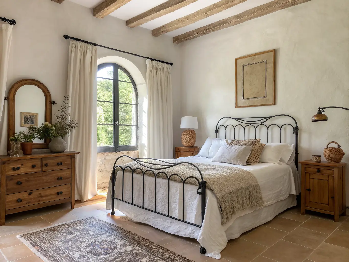
Metal: Wrought iron or dark bronze for lighting, bed frames, chair bases. Wrought-iron or brass pendant lights run $120–$800. Mix in some brass or antique brass if the room starts feeling too heavy and blacksmith-shop — brass softens iron nicely.
Textiles: Linen, cotton, wool, low sheen, relaxed drape. Linen curtains run about $60–$250 a panel. Don’t iron them crisp — a little wrinkle is correct here.
Ceramics: Hand-thrown vases, amphora shapes, glazed bowls. Expect $20–$120 per piece for decent ceramics, more for something genuinely handmade. This is where thrifting pays off — I found a lopsided, clearly handmade olive-glazed vase at an estate sale for $12 that looks better than anything I could’ve bought new.
The Arch: Your Single Best Signature Move
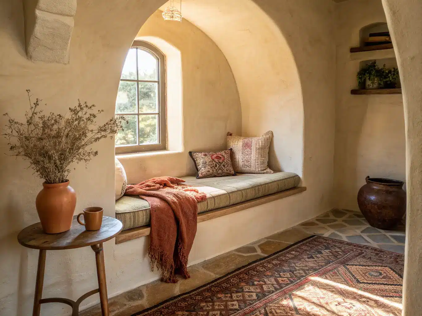
If you do nothing else, add one arch. It’s the clearest visual shorthand for this style — more than color, more than tile. An arched mirror, an arched mirror-shaped headboard, an arched niche cut into a wall, even an arch-topped cabinet.
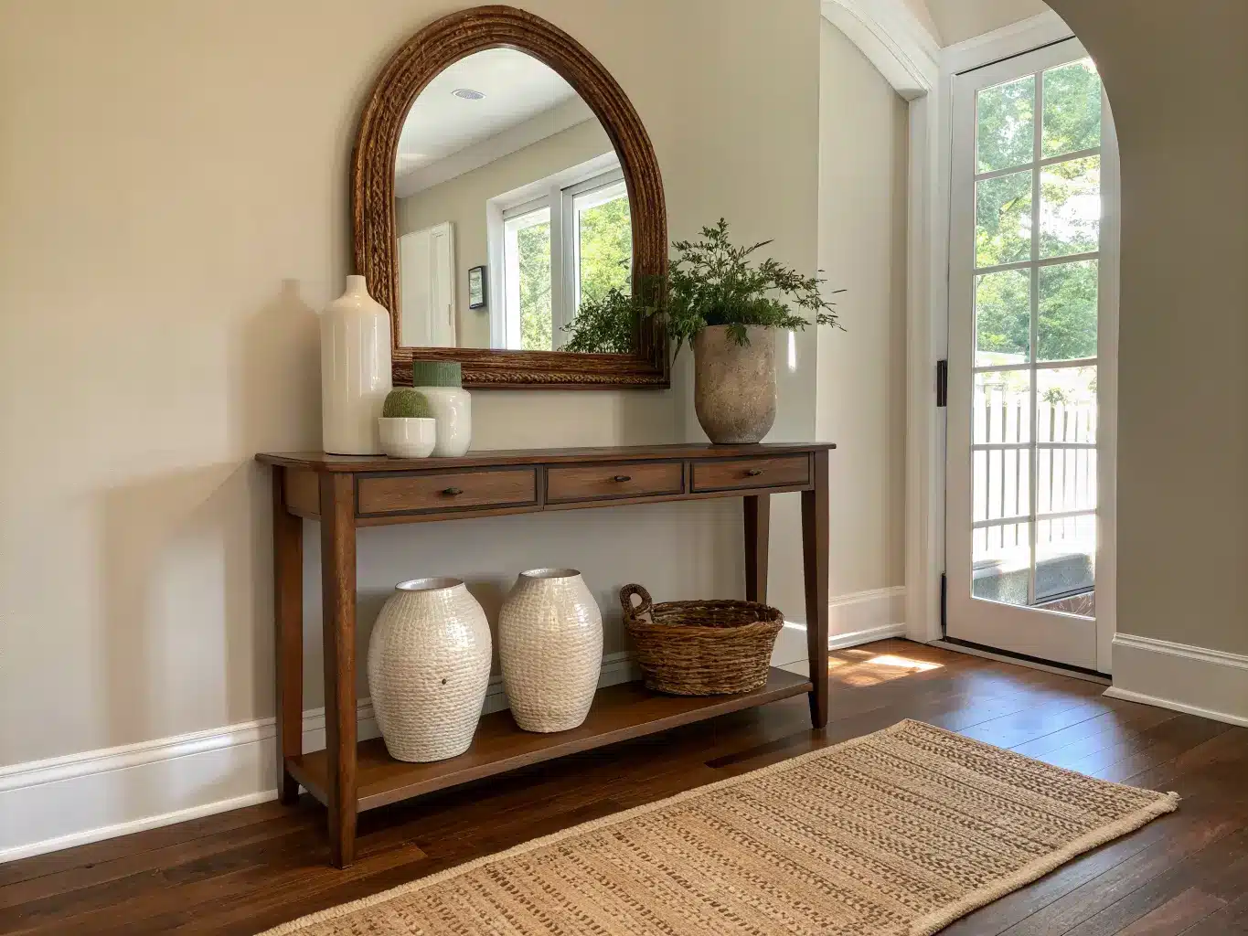
I put an arched rattan-framed mirror over my console table and it did more to signal “Mediterranean” than the three ceramic vases sitting beneath it combined. If you’re renting and can’t touch walls, a freestanding arched mirror or an arch-shaped piece of wall art gets you there without a contractor.
How to Actually Put the Room Together, Step by Step
Work in this order — largest decisions first, accessories last:
1. Settle the walls and floor. Warm white or cream walls, natural-toned flooring. This is your canvas; don’t skip ahead to accessories before this is locked.
2. Place one anchor piece. A stone coffee table, a carved wood dining table, an iron bed frame. Something with weight that the rest of the room can build around.
3. Layer textiles. Linen curtains, a jute or wool rug, maybe both stacked — a jute base rug with a smaller vintage-pattern wool rug on top adds texture without adding visual noise.
4. Pick your one accent color family for that specific room. Terracotta in the bedroom, cobalt in the bathroom, olive in the kitchen — don’t repeat the same accent in every room or the house starts to feel like a theme park.
5. Finish with ceramics, branches, and lighting. A few olive branches or dried lavender in a hand-thrown vase, an iron pendant overhead, the arched mirror. This is the last 10% and it’s tempting to do it first — resist that.
Budget Breakdown: What This Actually Costs
– Budget refresh ($200–$1,500): New textiles, a couple of ceramic pieces, a mirror, small lighting swaps. This is where I started and it’s genuinely enough to shift a room’s whole feeling.
– Mid-range update ($2,000–$8,000): Add a real rug, a sofa or dining chairs, a statement pendant light, one large mirror, a stone or wood accent table.
– Renovation-heavy ($8,000–$30,000+): Plaster walls, terracotta or stone flooring, custom cabinetry, arched doorways, built-in niches. This is the “we’re not moving for a decade” version.
Spend on: flooring, wall finish, and one real stone or solid wood piece — these set the tone and you’ll notice a cheap substitute immediately.
Save on: ceramics (thrift and vintage shops are full of them), textiles (linen is linen, you don’t need the $250 curtain when a $70 one drapes the same), and branches/greenery (a $15 bundle of dried olive branches looks the same as a $60 one).
Where People Get This Wrong
Going full nautical. Rope mirrors, shells, anchors, starfish — that’s beach-house decor, not Mediterranean. Mediterranean is about architecture and material, not seaside souvenirs. This was my exact mistake and it’s the one I see most often.
Oversaturating the palette. Bright, primary-toned blues and yellows read more “kids‘ resort” than “sun-faded Amalfi villa.” The current, better version of this style leans muted and earthy — think sun-bleached, not fresh-off-the-shelf.
Piling on ornamentation. Carved wood everywhere, pattern on every surface, a mosaic tile floor AND patterned pillows AND a carved headboard. Pick one or two places for pattern — a tile backsplash, a single rug — and keep the rest calm.
Glossy finishes. Lacquered furniture, shiny tile, high-gloss paint. All of it fights the matte, sun-worn quality that makes this style feel authentic. If it reflects light like a mirror, it doesn’t belong here.
Oversized furniture. A huge sectional or a heavy dark wood armoire can choke the airy feeling the style depends on. Mediterranean rooms need room to breathe — leave sightlines open, especially toward windows or doors.
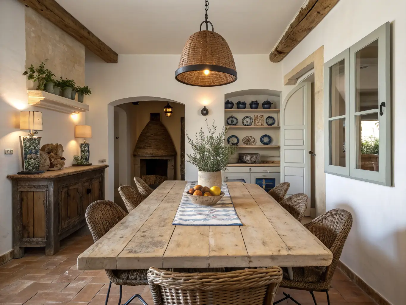
Small-Space Application: Yes, It Works
You don’t need a villa. In my one-bedroom apartment, I couldn’t touch the flooring or walls (rental, no landlord permission for limewash), so I leaned entirely on textiles, ceramics, and one arched mirror. A jute rug, linen curtains, a terracotta lamp base, and dried eucalyptus in a $10 thrifted vase got 70% of the way there. Small spaces actually benefit from this style’s editing principle — you’re forced to choose a few good pieces instead of filling every surface, which is exactly the restraint the style wants anyway.
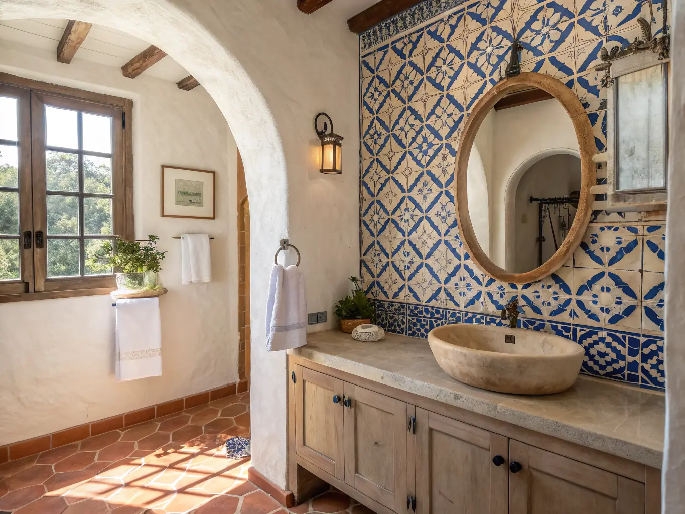
For kitchens and bathrooms specifically: a patterned tile backsplash or shower surround (Moorish or Spanish-tile-inspired) is the highest-impact, lowest-square-footage move you can make. It’s the one place I’d actually encourage more pattern, not less, since it’s contained to a single wall or surface.
Keeping It Fresh Season to Season
Swap textiles, not furniture. Lighter, undyed linen in warmer months. Deeper rust, clay, and olive-toned throws and cushions in fall and winter. The bones — the plaster, the stone, the wood — don’t move. Only the layer on top shifts.
If you want to push the style in a different direction without abandoning it:
– Toward Organic Modern: cleaner lines, less pattern, more plaster and oak, fewer accessories overall.
– Toward Coastal: lighter blues, more woven texture, a breezier, more open layout.
– Toward Boho: more layered textiles, more handmade pottery, global pattern mixed in more freely.
The version I landed on sits closer to organic modern — restrained, mostly neutral, with terracotta and olive as my only real color notes. It’s not the version with the mosaic-tiled kitchen and the carved wood everywhere. But it’s the one that’s held up two years later without me getting sick of it, which might be the actual test of whether a style is working.
More Ideas to Explore
Keep the momentum going: Farmhouse Kitchen Shelf Ideas: How to Style Open Shelving Like a Pro covers another angle worth a look.