Neutral Nursery Ideas That Don’t Look Boring (Or Beige-on-Beige Flat)
If you’ve searched neutral nursery ideas, I’d bet you’ve also typed some version of “how do you make a neutral nursery not look boring.” I did the exact same search four years ago, staring at a pile of paint chips that all looked like sad oatmeal. I get the appeal of neutral — you don’t know if you’re having a boy or girl, or you just don’t want a room that screams “nursery” the second your kid turns three. But there’s a real risk of ending up with a room that reads more “empty rental unit” than “calm, considered space.” I made that mistake the first time around. My son’s nursery looked like a furniture showroom for the first two months because I’d bought everything in the same shade of greige and called it done.
Here’s what actually works, based on redoing that room twice and helping my sister do hers last year without any of my early mistakes.
What a Neutral Nursery Actually Looks Like
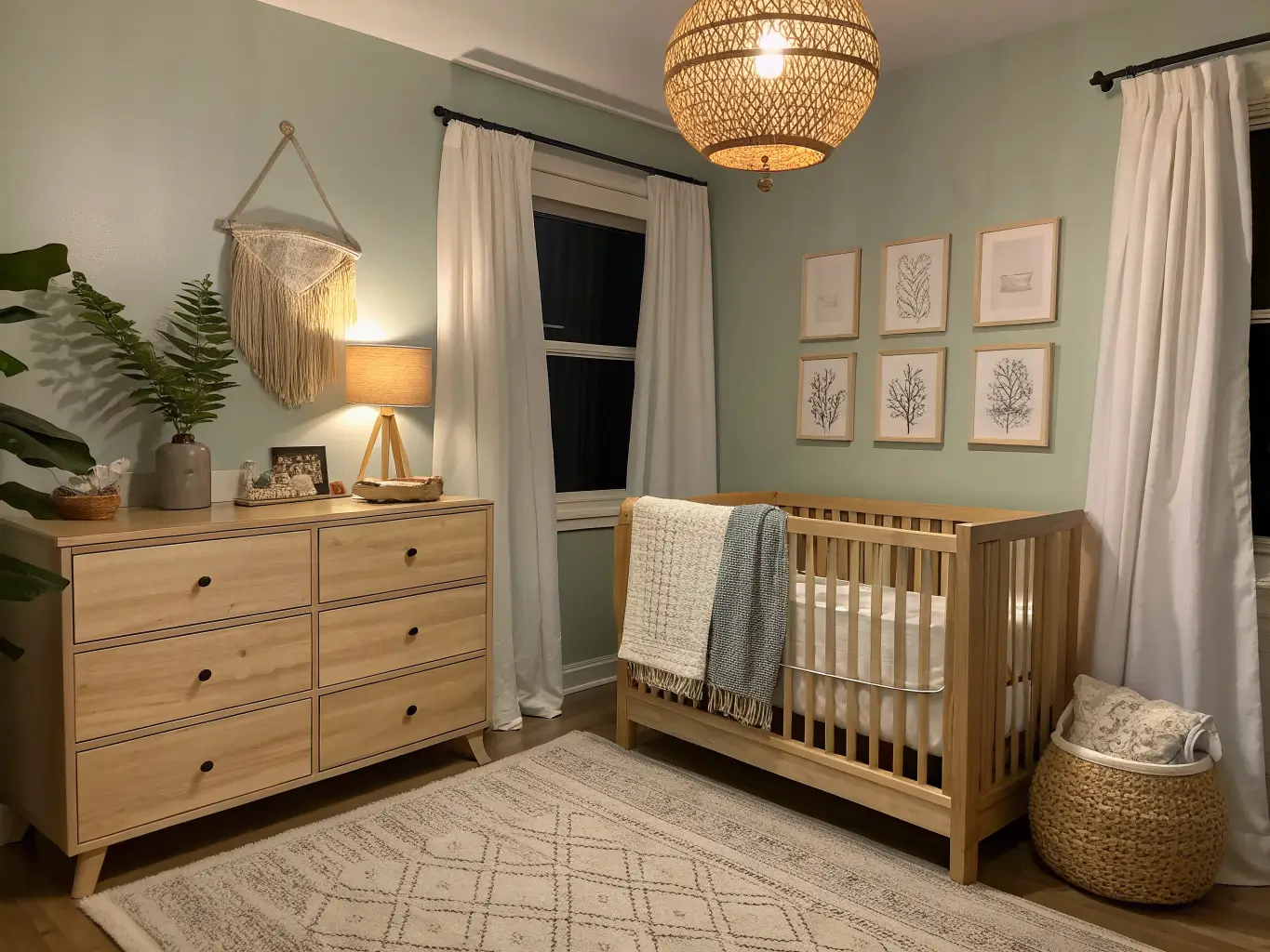
The style is modern neutral, but it borrows heavily from Scandinavian, boho, farmhouse, and soft minimalism depending on how you layer it. The core palette is warm white, cream, ivory, beige, taupe, greige, sage green, and pale wood. Materials lean natural: wood, rattan, wicker, woven baskets, linen, cotton, wool, and the occasional matte black or brushed metal accent for contrast.
This look is ideal if you want a gender-neutral nursery, a room that feels calm enough for actual sleep (yours and theirs), or a space that can slide into toddlerhood without a full redo. It works in small nurseries, shared sibling rooms, and guest rooms doing double duty — warm whites and pale wood visually open up a tight space in a way that saturated color just doesn’t.
Setup time: A basic refresh with existing furniture takes 1–3 days. If you’re painting, wallpapering, and assembling new furniture, budget 1–2 weeks working in phases — foundation pieces first, then texture and accessories.
Cost ranges I’d actually plan around:
– Budget refresh ($250–$700): keep your existing crib and dresser, add paint, textiles, baskets, and a few framed prints.
– Midrange ($900–$2,500): new crib, dresser, glider, rug, lighting, and decor.
– Higher-end ($3,000+): designer furniture, a washable statement rug, sculptural lighting, mural wallpaper.
I landed right in the midrange the second time and it was worth every dollar, mostly because I stopped buying cheap textiles that pilled after two washes.
The Pieces That Actually Make the Room
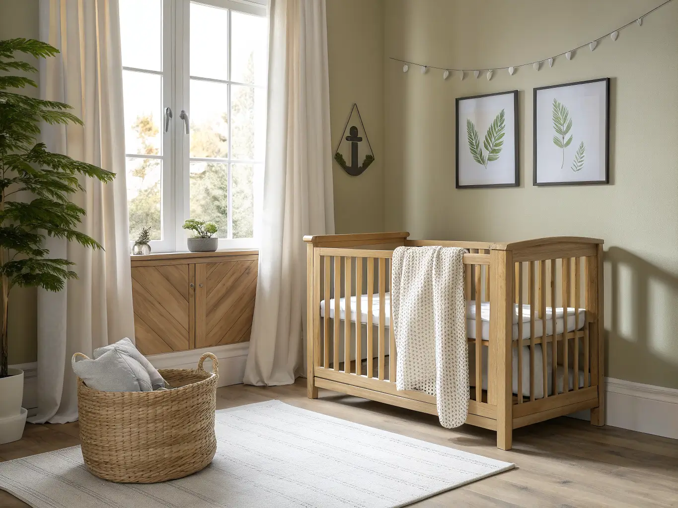
The crib. This is your anchor, so don’t skimp on finish quality even if you skimp on style. A natural wood crib (something like a light oak or ash tone) or a crisp white crib with simple lines both work. Avoid ornate spindles or dark espresso finishes — they pull the room toward traditional, not neutral-modern.
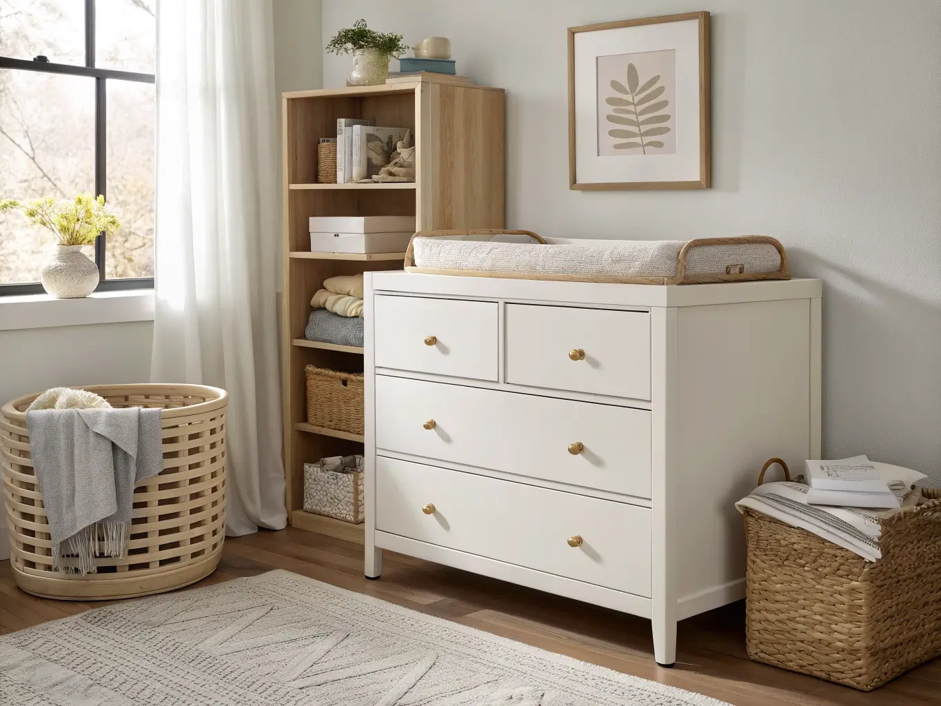
The dresser. Skip the dedicated changing table. A streamlined dresser with a changing pad on top does the same job and survives past infancy. I used a $180 unfinished pine dresser from a local furniture store, painted it warm white myself, and it’s now just a regular dresser in my son’s room.
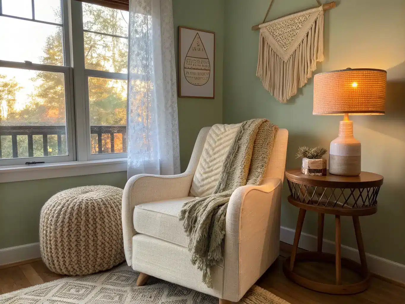
The glider. Get upholstery in ivory, oatmeal, taupe, or gray — something that hides milk stains, because it will need to. Bouclé is having a moment here and it’s genuinely practical, not just trendy; the texture camouflages everyday wear.
The rug. A washable, textured neutral rug is non-negotiable in my book. I bought a flatweave jute rug the first time — beautiful, scratchy, useless once there was actual crawling involved. Second time around I got a washable low-pile rug in a subtle diamond pattern, and it’s the single best purchase in the room.
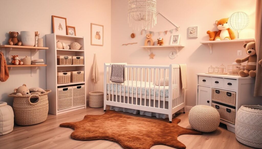
Storage baskets. Woven seagrass bins and fabric cubes aren’t decoration, they’re damage control. Nurseries generate an absurd volume of small stuff — muslins, socks, teething toys — and open shelving without baskets just looks like a mess with good lighting.
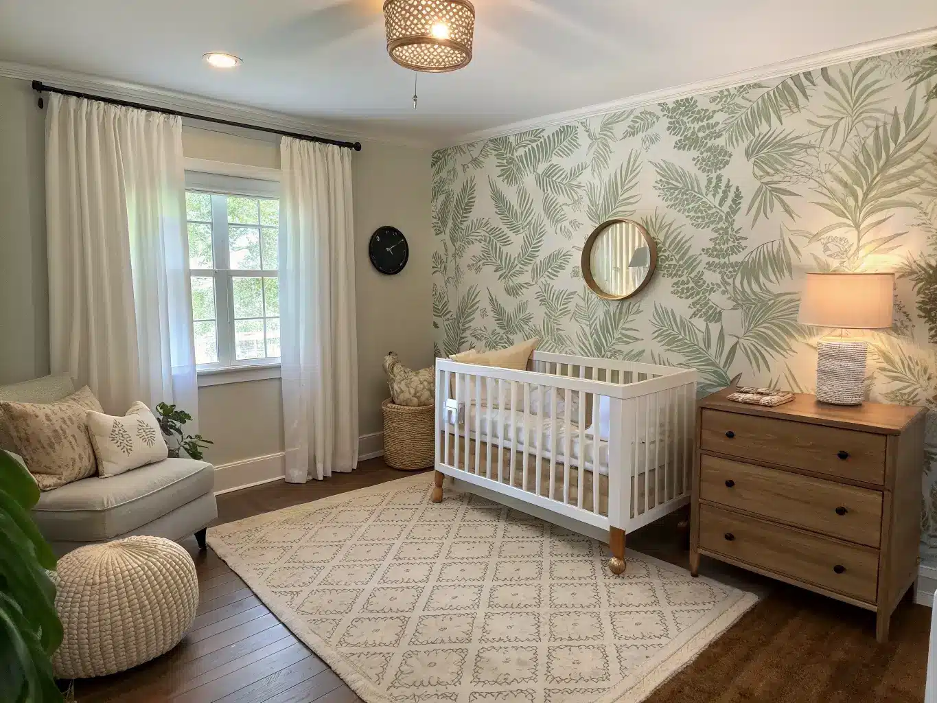
Wall treatment. Soft white or greige paint is the safe base. If you want more personality, a sage accent wall, subtle striped wallpaper, or a woodland mural behind the crib adds interest without committing to a “theme.”
Lighting. A dimmable lamp or a woven pendant does more for the mood of a nursery than almost anything else on this list. Overhead flush mounts alone feel clinical at 3 a.m.
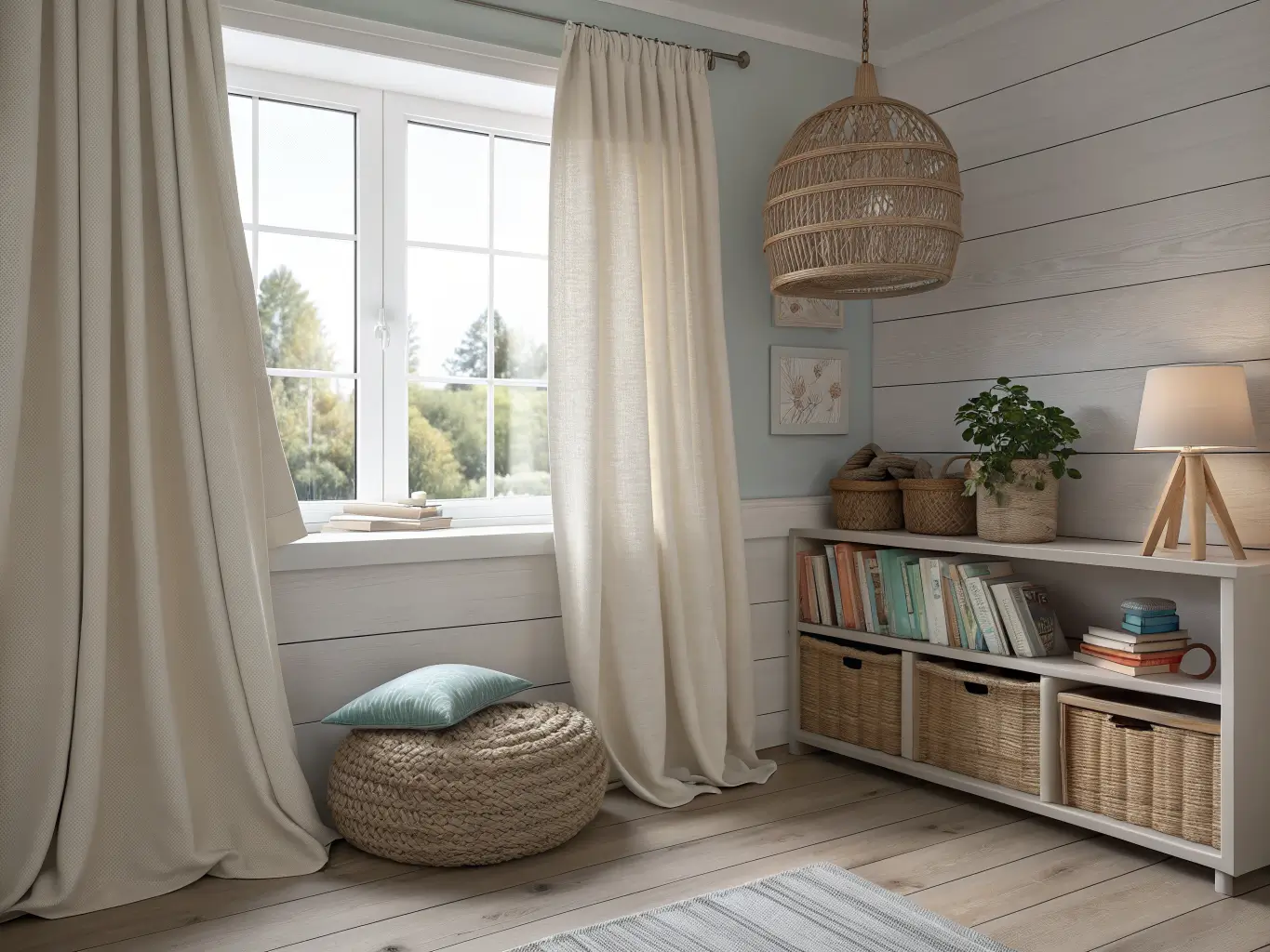
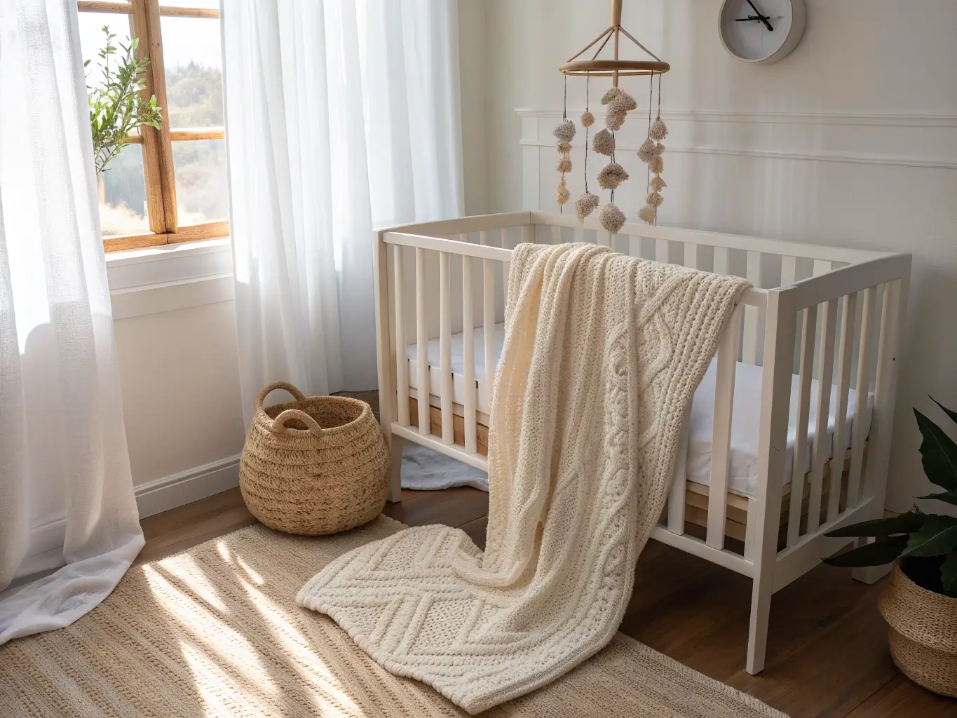
Textiles. Muslin crib sheets, a chunky knit blanket, linen curtains, one textured throw over the glider. This is where warmth actually comes from.
How to Layer It So It Doesn’t Fall Flat
This is the part everyone skips, and it’s the actual answer to “how do I make this not boring.”
– Use at least three textures. Wood crib, woven basket, soft knit blanket — that trio alone keeps a beige-heavy room from feeling like a single flat surface.
– Pick one main neutral and one accent neutral. Ivory plus sage. Cream plus taupe. Don’t mix five neutrals and hope it reads as “curated” — it usually reads as “didn’t decide.”
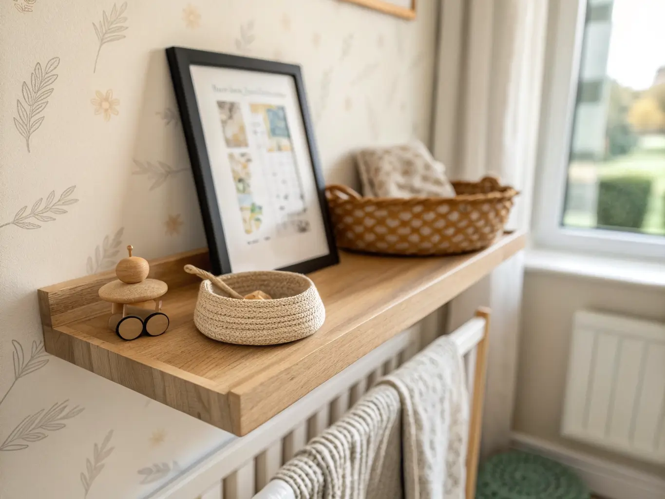
– Add small black details if it feels washed out. A black lamp base, a black picture frame, matte black crib hardware. Tiny doses of contrast do a lot of work in an all-light-tone room.
– Choose small-scale pattern over busy prints. Stripes, dots, herringbone, small botanicals. Big, bold prints fight the calm the whole style is going for.
– Give the room one focal point. Usually the wall behind the crib — wallpaper, a large framed print, or a floating shelf with a few objects. Everything else should be quieter than that wall.
Setting It Up: The Actual Order of Operations
1. Paint first. Warm white or light greige, always before furniture goes in.
2. Place the big pieces: crib, dresser, glider, rug — in that order, because the rug placement depends on where the furniture lands.
3. Layer soft goods: curtains, crib sheets, a throw for the glider.
4. Add one patterned element — wallpaper, a mural, or a striped accent wall — so the room has a visual anchor beyond furniture.
5. Style the changing area with the dresser, baskets underneath or beside it, and a lamp on top.
6. Finish with the personal stuff: books on a small shelf, a couple of framed prints, a neutral mobile over the crib (not directly above where baby’s head will be — check the safe zone).
Don’t skip straight to step 6. I did that the first time, hanging art and a mobile in an empty room, and it just highlighted how unfinished everything else was.
Mistakes I’d Tell You to Skip
– Going all-monochrome. A room that’s beige walls, beige crib, beige rug, beige glider looks like a furniture warehouse, not a nursery. Mix in texture or it goes flat fast.
– Cool gray only. Gray-on-gray nurseries were everywhere five years ago and they read cold now. Warm it up with cream, wood tones, or a sage accent instead of leaning all-gray.
– Over-theming. One woodland wallpaper wall is charming. Woodland wallpaper plus a fox lamp plus a forest mobile plus antler hooks is a theme park.
– Skipping storage. I promise you will regret this by week three. Baskets aren’t optional.
– Buying decor too specific to “baby.” Alphabet prints and nursery-only decor age out fast. Neutral pieces — botanical prints, simple shape mobiles, plain frames — carry into toddler years without a redo.
Keeping It Cohesive Without Getting Boring
Stick to 2–4 core neutrals total — ivory, oatmeal, taupe, sage, pick your combination and don’t wander outside it. Repeat your materials on purpose: if the crib is wood, echo that wood tone somewhere else — a shelf, a frame, the mobile ring. That repetition is what makes a room feel decorated rather than assembled from a registry list.
Leave some negative space too. Not every wall needs art, not every surface needs an object. A nursery that’s overly styled stops feeling restful, which defeats the point.
Seasonal refreshes are easy and cheap: swap pillow covers, throws, or art for sage, sand, dusty blue, or muted terracotta depending on the season, while keeping the wall color and furniture the same. A new lamp shade or a set of baskets can reset the whole feel of the room for under $50.
If you want to push the style further, try:
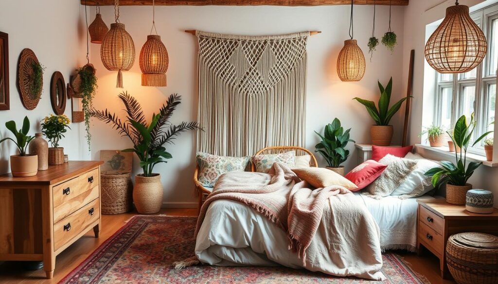
– Neutral + Boho: rattan chair, macramé wall hanging, layered woven textures
– Neutral + Scandi: pale wood, white walls, minimal styling, nothing extra
– Neutral + Woodland: leafy wallpaper, subtle animal motifs, natural wood, small green accents
– Neutral + Modern: black-and-white details, sculptural lighting, clean furniture lines
I ended up somewhere between Scandi and woodland in my son’s room — pale oak crib, white walls, one wall of botanical wallpaper behind the crib, and a single framed print instead of a gallery wall. It’s held up for three years without feeling dated, which was the entire point of going neutral in the first place.