Kitchen Backsplash Ideas: A Room-by-Room Guide to Getting It Right
Kitchen backsplash ideas are easy to pin and hard to commit to, because this is the one surface in your kitchen you’ll stare at every single day while you’re waiting for coffee to brew. I redid mine twice in the same year before I got it right, which is a stupid and expensive way to learn what I’m about to tell you for free.
The first time, I picked a busy Moroccan-pattern tile because it looked incredible on Pinterest. In my actual kitchen, next to my already-veiny quartz countertop, it looked like the wall was arguing with the counter. I lived with it for four months before I ripped it out. Lesson learned: the backsplash doesn’t operate alone. It’s one piece of a system that includes your counters, cabinets, and lighting, and it has to get along with all of them.
Here’s everything I’ve figured out, from cost to layout to the mistakes that quietly wreck an otherwise good kitchen.
Quick Style Snapshot
Time needed: A peel-and-stick backsplash is genuinely a Saturday-afternoon job — I did my sister’s rental kitchen in about three hours, including cleanup. A real tile installation is a multi-day affair once you factor in surface prep, setting the tile, letting thinset cure, grouting, and sealing. Full-slab stone is its own animal entirely — you’re not doing that yourself. It requires a fabricator to template your walls, cut the stone, and install it, which usually means a one-to-two week lead time before installation day even happens.
Cost: Peel-and-stick sheets run roughly $10–$25 each and most kitchens need somewhere between 10 and 20 sheets. A standard ceramic or porcelain subway tile job, done professionally, typically lands between $600 and $2,500 depending on square footage and labor rates in your area. Want zellige, marble, or a slab? Budget $2,000 on the low end and don’t be shocked if it climbs past $5,000 for a full slab with professional fabrication and installation.
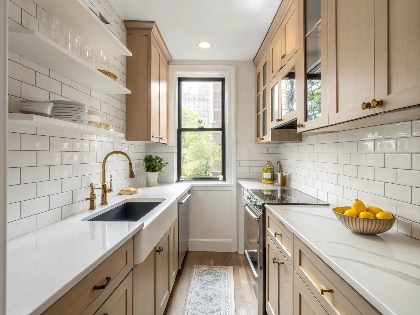
Ideal space size: Backsplashes work in everything from a five-foot galley kitchen to a sprawling open-concept great room. The difference is what you choose. Small kitchens want light-reflective surfaces — white tile, glass, mirrored finishes — because they bounce light around and make the walls feel like they’re not closing in on you. Bigger kitchens can handle a dark, dramatic slab or a bold color without feeling oppressive, because there’s enough room for the eye to rest elsewhere.
DIY skill level: Peel-and-stick, paint, and beadboard are true beginner projects — no special tools, minimal risk. Standard tile layouts (straight subway, basic grid) are intermediate; you need a wet saw, spacers, and patience, but it’s learnable. Herringbone, chevron, intricate mosaics, and anything in natural stone slab should go to a professional. I say this as someone who tried to cut her own herringbone pattern with a $40 tile cutter and ended up with a wall that looks fine from six feet away and terrible up close.
Seasonal appeal: This is a permanent surface, not a decor item you swap out. The strongest backsplashes are designed to be a quiet, durable backdrop year-round — you bring in seasonal personality through a runner, a bowl of citrus, dish towels, not by touching the tile.
Design Identity: What’s Actually Popular Right Now
The current backsplash landscape has a few clear leaders:
– Slab-minimal — full slabs of marble or quartzite that run wall-to-wall with barely visible seams
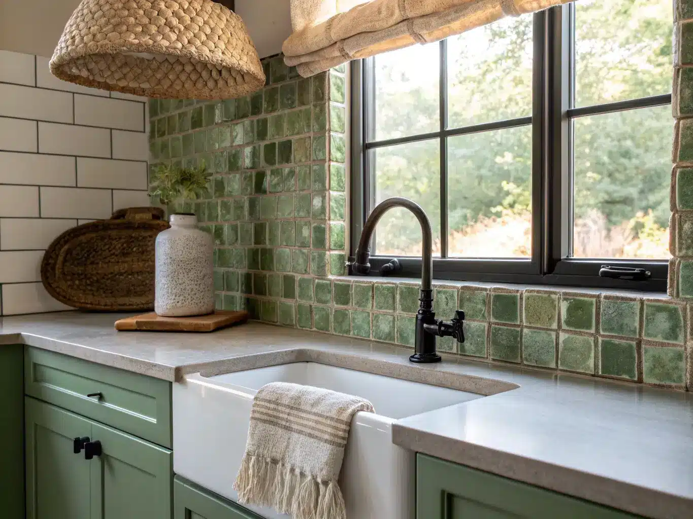
– Zellige and handmade tile — irregular, glossy, slightly imperfect tiles that add texture without pattern
– Classic subway — still everywhere, but styled differently through layout and grout color
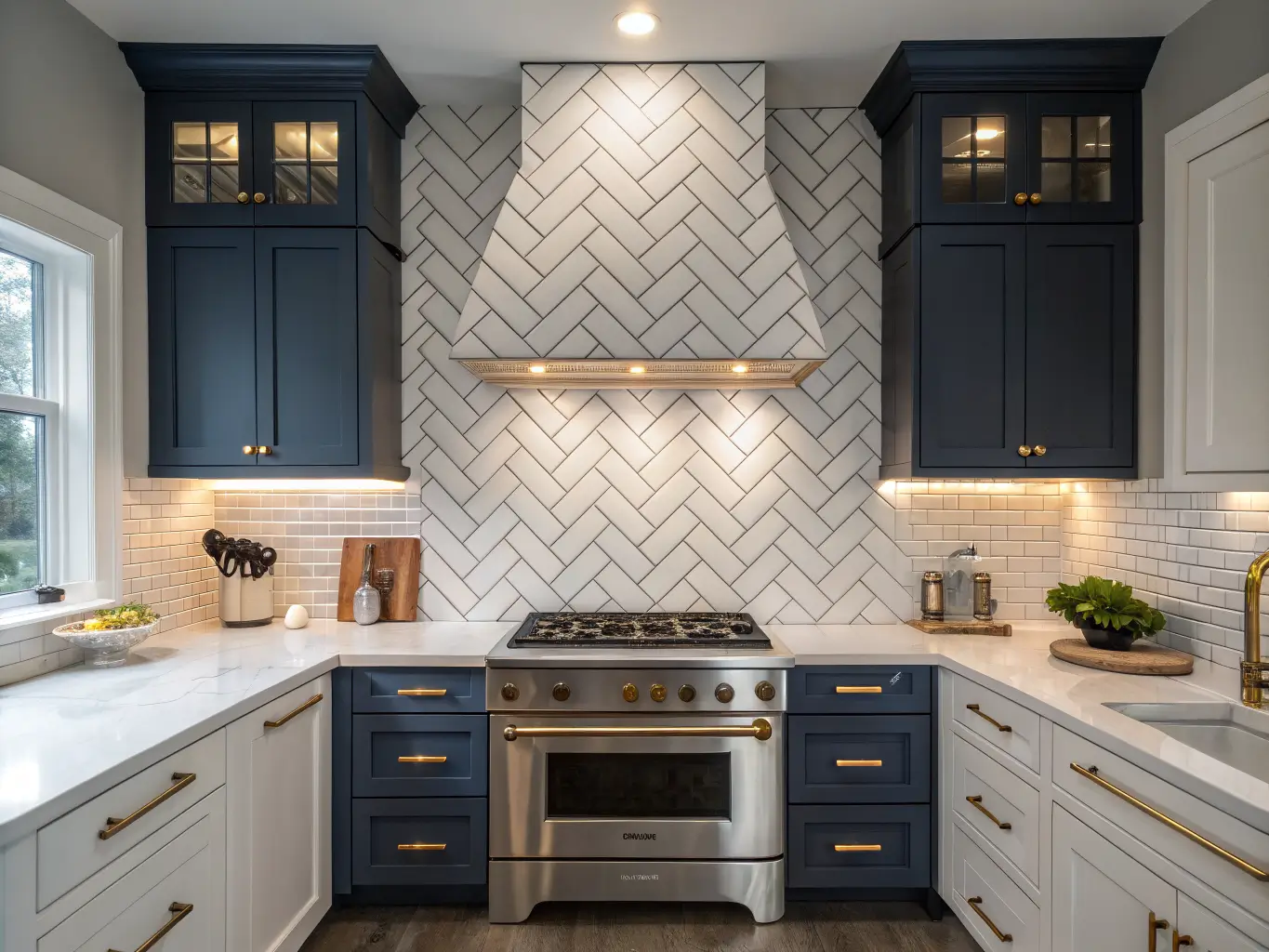
– Herringbone and chevron — angled layouts that dress up an inexpensive tile
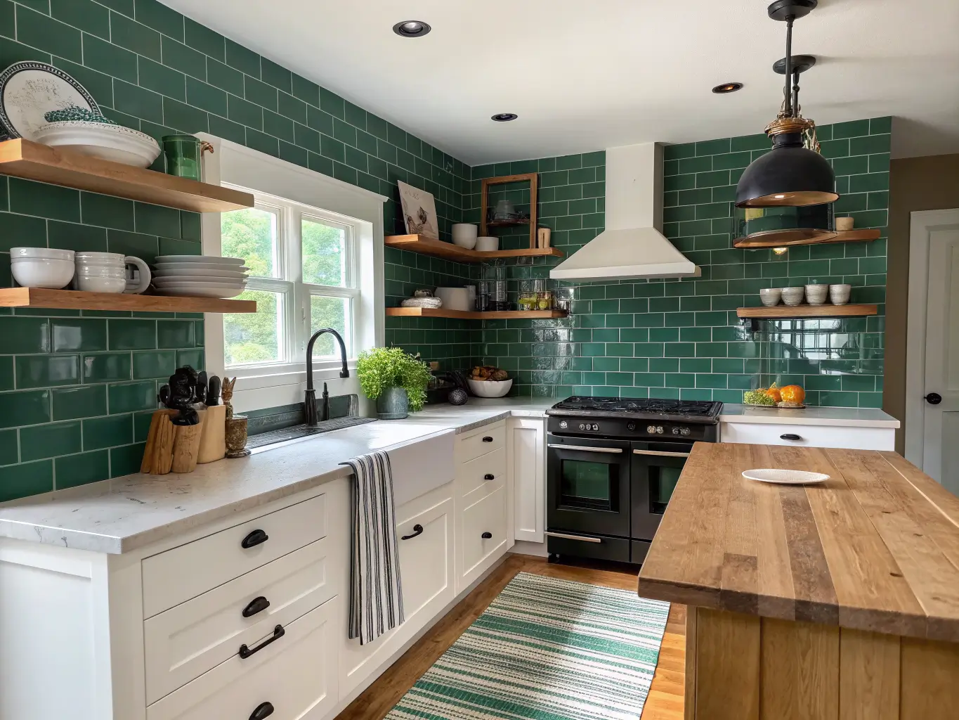
– Statement color — deep emerald, black-and-white contrast, blue-green tones
– Mixed-material focal walls — combining tile with a wood shelf, a metal strip, or a stone inset
Color and material-wise, I’m seeing a lot of warm white, honed natural stone, deep green, black-and-white, marble, glass, mirrored tile, and metal accents in brass or copper. This style works best for people who want a real visual upgrade without gutting the whole kitchen — renters leaning on peel-and-stick, and full renovators trying to make the backsplash, countertop, and cabinets feel like they were chosen by the same person (a lower bar than it sounds, and one a lot of kitchens fail).
As for placement: the classic move is behind the range and along the sink wall. But full-wall-to-ceiling backsplashes are having a moment, as is the opposite — a small, deliberate high-impact zone (say, just behind the range) while the rest of the kitchen stays simple.
Styling & Decor Essentials
The Hero Pieces
Pick one of these as your backbone material:
– Subway tile, stacked, vertical, or herringbone — the most flexible option because the layout does the personality work
– Zellige-style tile for handmade texture and warm, uneven gloss
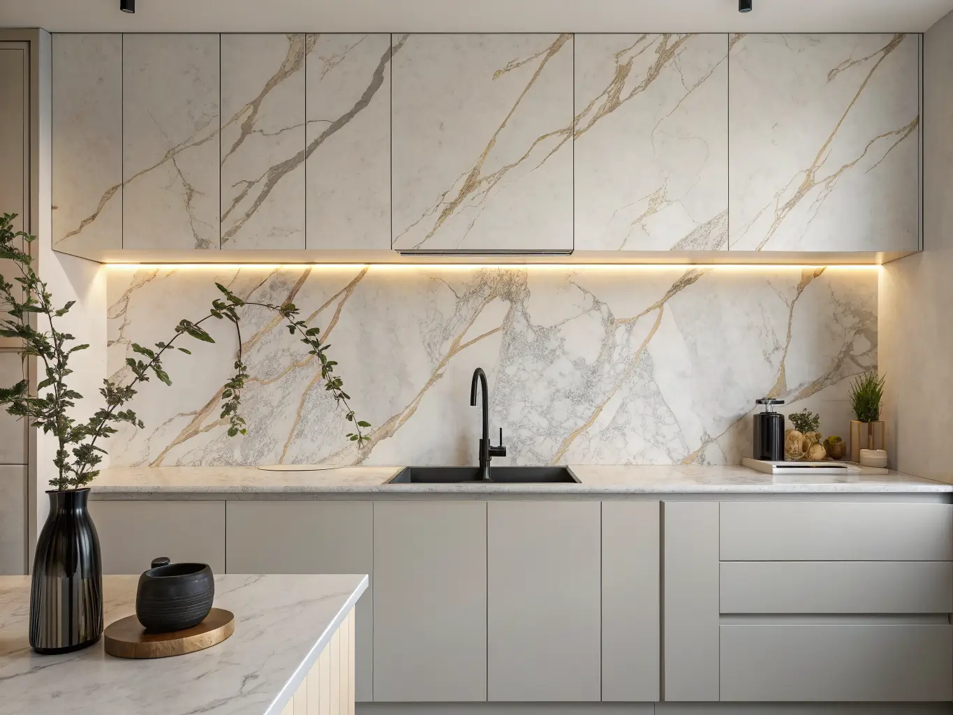
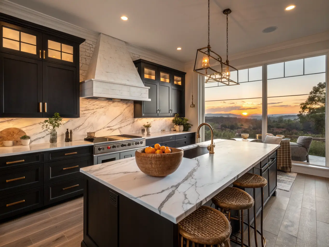
– Marble or quartzite slab for a seamless, high-end look with almost no grout lines
– Glass tile when you need brightness and light bounce
– Mirrored tile specifically for small or dark kitchens — it doubles perceived depth
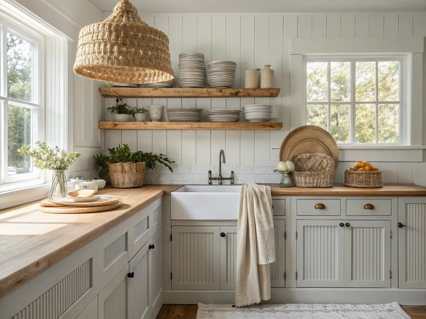
– Beadboard or shiplap for farmhouse and cottage kitchens
– Peel-and-stick for renters or anyone testing a look before committing
What Surrounds It
The backsplash doesn’t work in isolation. Cabinets in white, deep green, navy, black, or warm wood; countertops in white quartz, marble, granite, or butcher block; hardware in brushed brass, matte black, or polished nickel — these all need to talk to each other. Open shelving and under-cabinet lighting matter too, because a backsplash you can’t actually see clearly at 7pm is a backsplash that’s not earning its cost.
Small Details That Change Everything
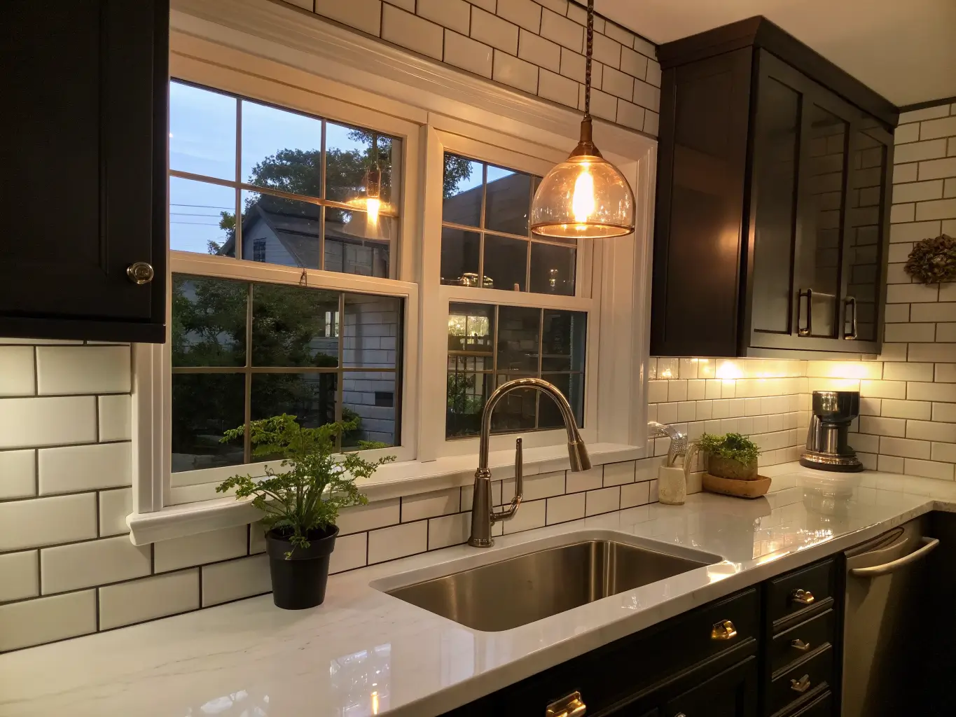
Grout color is not a footnote — it’s a design decision. White grout on white subway tile disappears and reads clean and quiet. Dark or black grout on the same tile turns it into a graphic grid pattern. I switched grout color on a bathroom project once (much smaller scale, same principle) and the tile looked like a completely different product. Gold-toned grout is having a moment for people who want a little glam without going full metallic tile.
Pro Styling Tips I Actually Use
Layer textures, don’t match them. Glossy tile against matte cabinets and a honed (not polished) countertop reads intentional. All-glossy everything reads like a showroom nobody lives in.
Pick one thing to be loud. If your countertop has heavy veining, keep the backsplash quiet — a simple white subway or a plain slab that echoes the counter without competing with it. If your countertop is simple quartz or butcher block, that’s your green light for a bold backsplash color or pattern.
Give the room one focal point, usually behind the range. This is where I’d spend on that zellige tile, framed tile inset, or patterned mosaic. Everywhere else can be simpler and cheaper. You don’t need drama on all four walls — one strong moment beats four competing ones.
Let layout do the heavy lifting. A $4-per-square-foot subway tile laid in herringbone looks entirely different from the same tile laid in a straight stack. Vertical stacking makes ceilings feel taller. Chevron and herringbone add movement to a plain white tile without spending more money on the tile itself.
Setup & Execution
Before You Touch the Wall
Clear the counters completely and take real measurements — from the top of your counter to the underside of your upper cabinets, and note any outlets, windows, or transitions you’ll need to work around. Check the wall itself for grease buildup, old adhesive, moisture damage, or uneven drywall. None of that shows up in the “after” photos you’re pinning, but it will absolutely show up in your finished project if you skip it.
Pick your countertop before your backsplash, not the other way around. This was my first mistake. I fell in love with a tile, then tried to find a countertop that worked with it, and spent three weekends miserable at stone yards. Countertops are more expensive and harder to change — let that decision lead.
Decide your termination point up front: stopping at the upper cabinets, running to the ceiling, or wrapping a window. This isn’t a detail to figure out mid-installation.
The Actual Process
1. Choose your material family — ceramic, porcelain, stone slab, glass, metal, paint, or peel-and-stick
2. Lock in your pattern — subway, vertical stack, herringbone, chevron, checkerboard, mosaic, or slab
3. Coordinate the palette — white and light tones open up the room; dark and jewel tones ground a larger kitchen
4. Add functional styling — under-cabinet lighting, a styled open shelf, one or two counter objects, no more
5. Finish with grout and trim — this step changes the whole visual outcome, so don’t treat it as an afterthought
Where I See People Go Wrong
– Choosing the backsplash first. It fights the countertop later. Ask me how I know.
– Over-patterning. Patterned tile plus busy countertop plus bold cabinet color is three loud voices talking at once. Pick one.
– Ignoring how light behaves in the room. Dark, matte finishes in a small, low-light kitchen will make it feel smaller. Reflective finishes — glossy tile, glass, mirror — genuinely open up a tight space.
– Awkward stopping points. A backsplash that just… ends, mid-wall, with no logic, looks unfinished. Stop at the cabinet line, run it to the ceiling, or frame a clear focal zone. Pick one on purpose.
– Choosing pretty over practical near the stove. Anything porous or hard to wipe down behind a range that sees regular grease splatter is a problem in six months. Ceramic and porcelain are boring recommendations because they work.
Keeping It Fresh Without Redoing the Whole Wall
Repeat 2–3 colors from your backsplash in your hardware, towels, or a runner so the kitchen feels pulled together instead of assembled from unrelated parts.
If the backsplash is your star, let it breathe. Clear the counters. A handmade zellige wall surrounded by clutter just reads as busy, not intentional.
Match your styling to your material. A textured, handmade tile backsplash wants natural counterpoints — a wood cutting board, a woven basket, linen towels. A sleek marble slab or mirrored tile wants cleaner, more tailored styling — skip the rustic ceramic bowl, it’ll look out of place.
For genuinely low-cost refreshes: swap in seasonal dishware and flowers, repaint the surrounding wall color, regrout if your grout has yellowed, or upgrade your under-cabinet lighting before you touch the tile itself. Lighting changes how a backsplash reads more than people expect — the same white subway tile looks flat under a bare bulb and genuinely warm under a 2700K LED strip.
A few combinations worth stealing:
– Boho + Coastal: whitewashed beadboard, sandy grout, woven pendant lights
– Farmhouse + Modern: classic subway tile with dark grout, matte black hardware
– Luxe + Minimal: slab backsplash with hidden seams, almost no counter styling at all
The backsplash you actually want is the one that still looks right to you in three years, not the one that photographs best on day one. Mine took two tries to get there. Yours doesn’t have to.